Preview Figma
Year
2022
Client
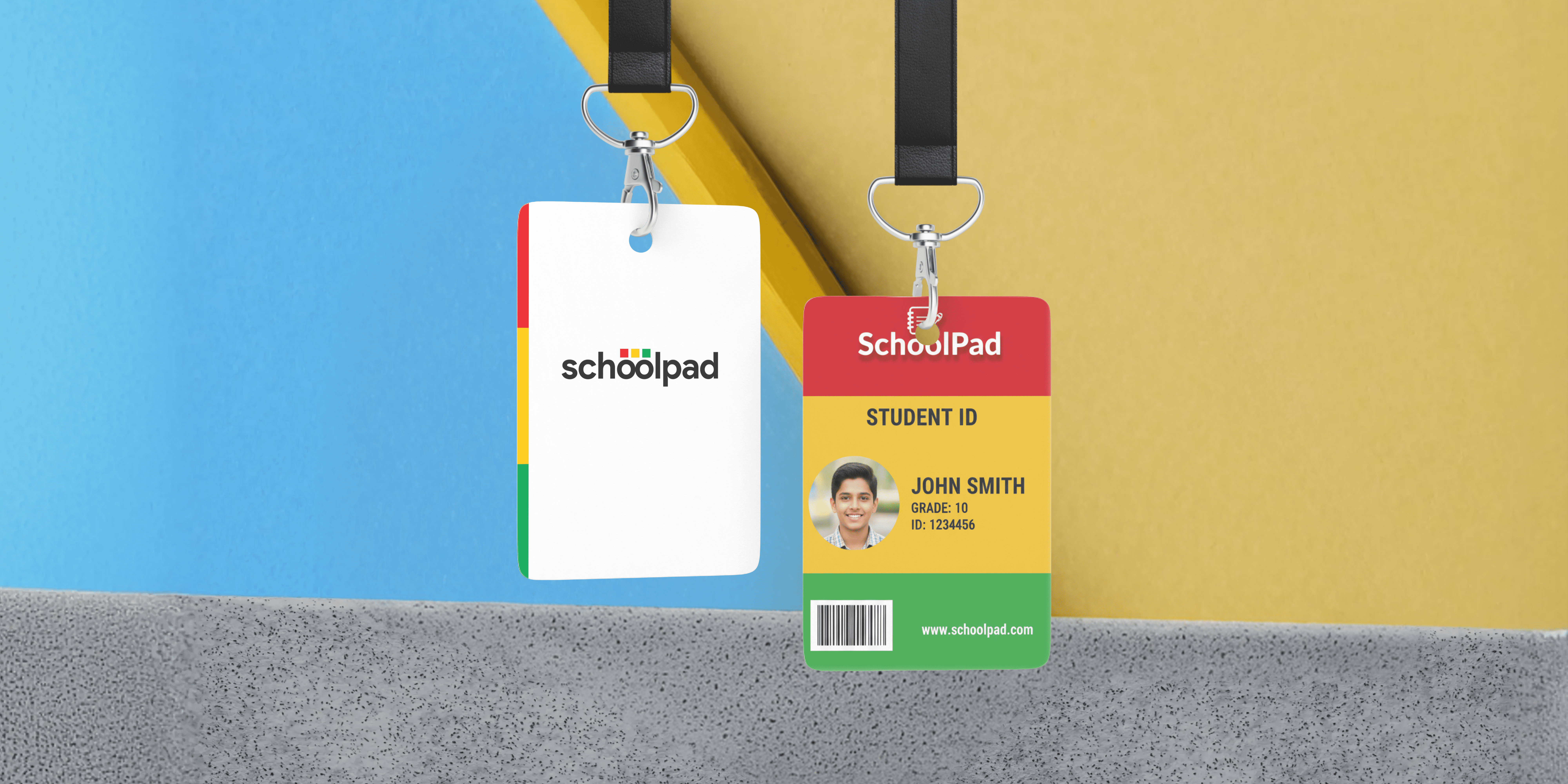
SchoolPad Technologies
Project Overview
Schoolpad’s legacy platform had become feature-heavy, visually outdated, and operationally inefficient. The redesign aimed to improve usability, cross-platform consistency, and workflow efficiency across all user groups — administrators, teachers, staff, students, and parents.
The Challenge
Rapid feature growth over the years resulted in fragmented UX across modules, data-heavy and overwhelming screens, misaligned workflows between web and mobile, and a steep learning curve for first-time users. Teachers and admins struggled to find key actions quickly, parents found the mobile app cluttered, and legacy technical constraints required solutions that aligned closely with Atlassian’s system to minimize development friction.
Discovery and Research Process
We conducted in-depth interviews with school admins, teachers across grade levels, operational staff, students, and parents. Insights revealed that teachers faced peak workloads and needed faster repetitive actions, admins required quick data summaries, and parents wanted instant updates without clutter. Heuristic evaluation exposed poor hierarchy, confusing terminology, redundant actions, inefficient layouts, and unnecessary workflow steps, while usage data highlighted drop-offs in attendance flows and low engagement with announcements and secondary modules.
Defining the Core Problem
Schoolpad users were spending excessive time completing routine tasks due to non-intuitive workflows, inconsistent UI, and lack of harmony between web and mobile experiences, leading to frustration, inefficiency, and reduced product adoption across roles.
Root Cause Analysis
The root causes included years of feature accumulation without IA re-evaluation, absence of a unified design framework, navigation that was not prioritized by user role, and a mobile app treated as a visual adaptation rather than a purpose-built experience.
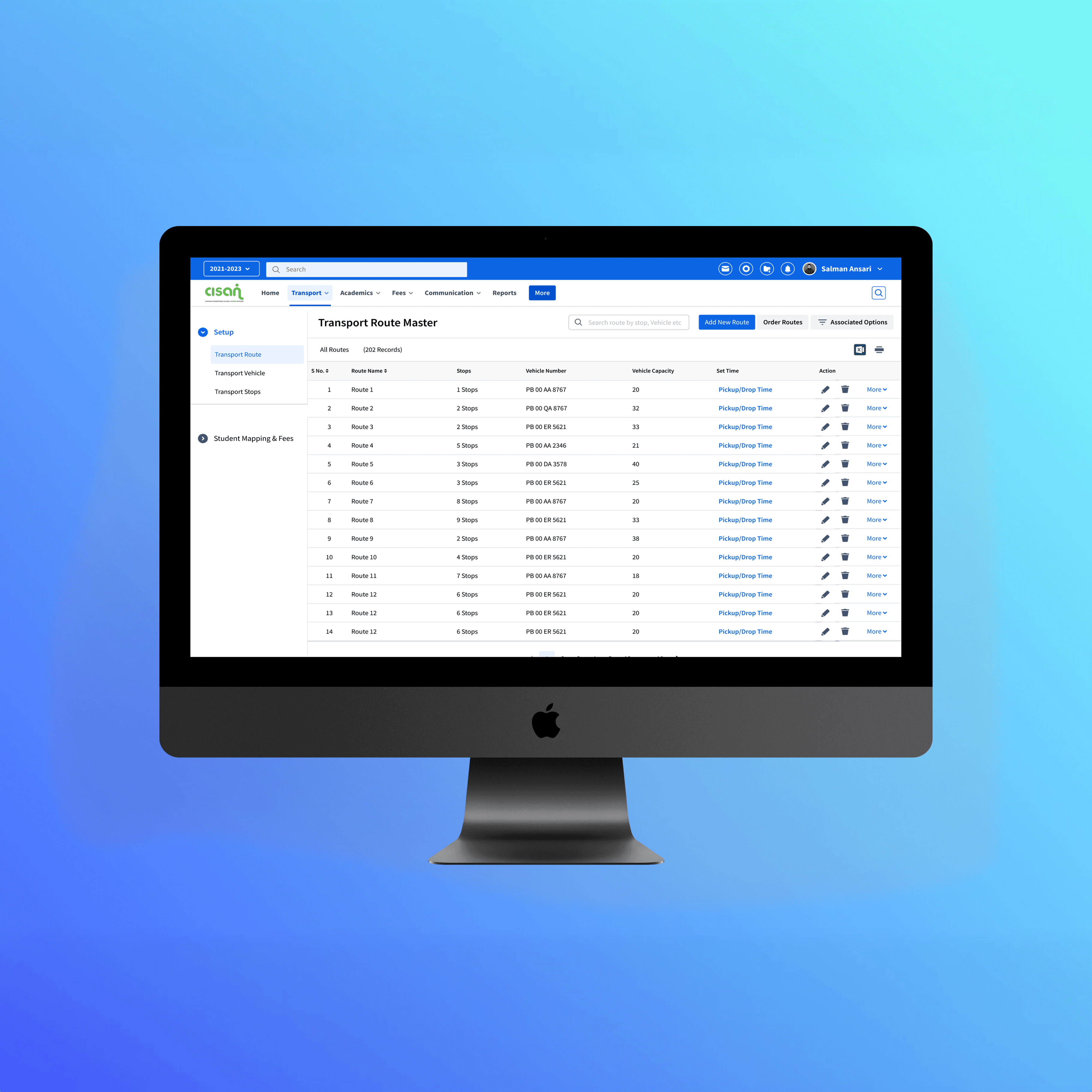
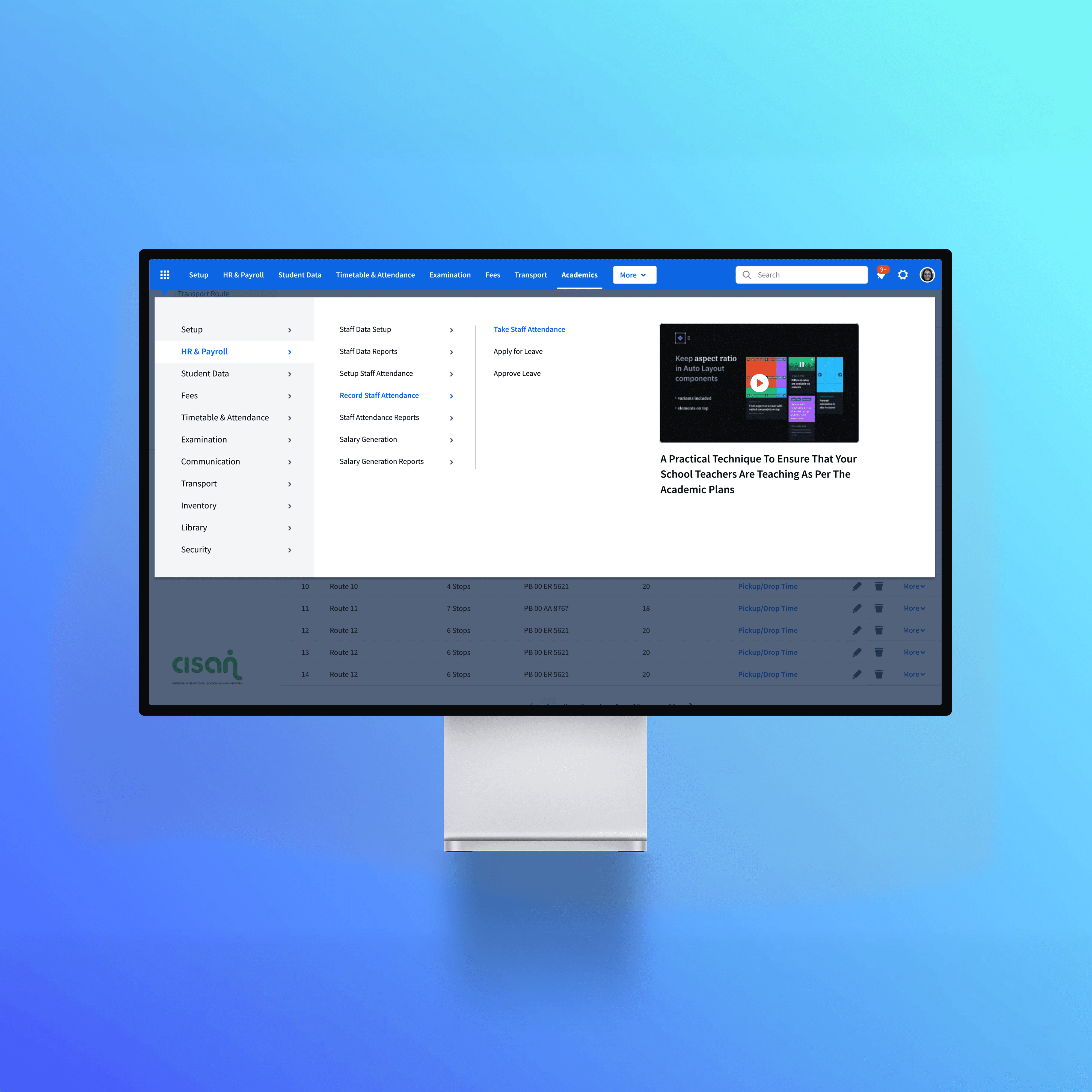
UX Strategy & Information Architecture
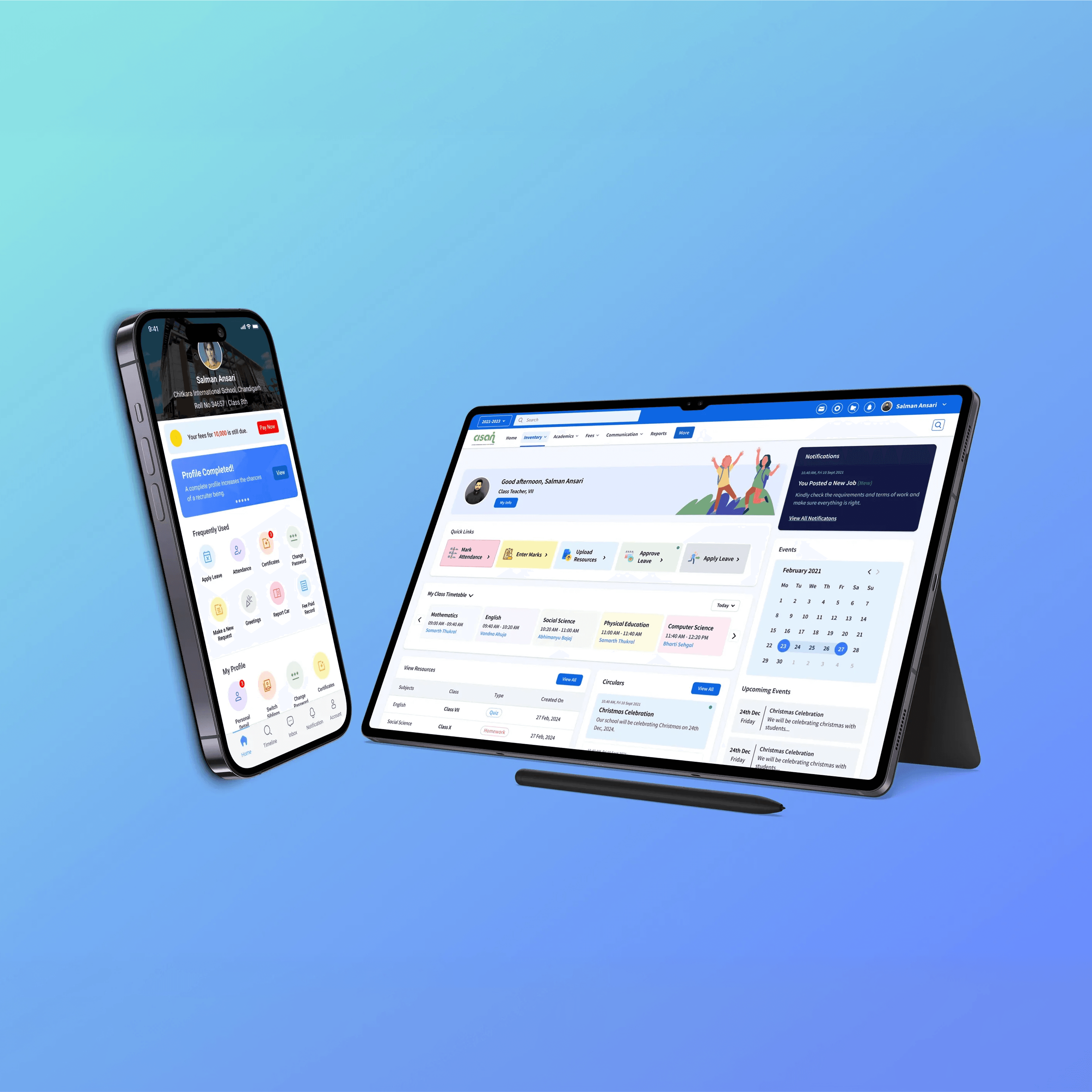
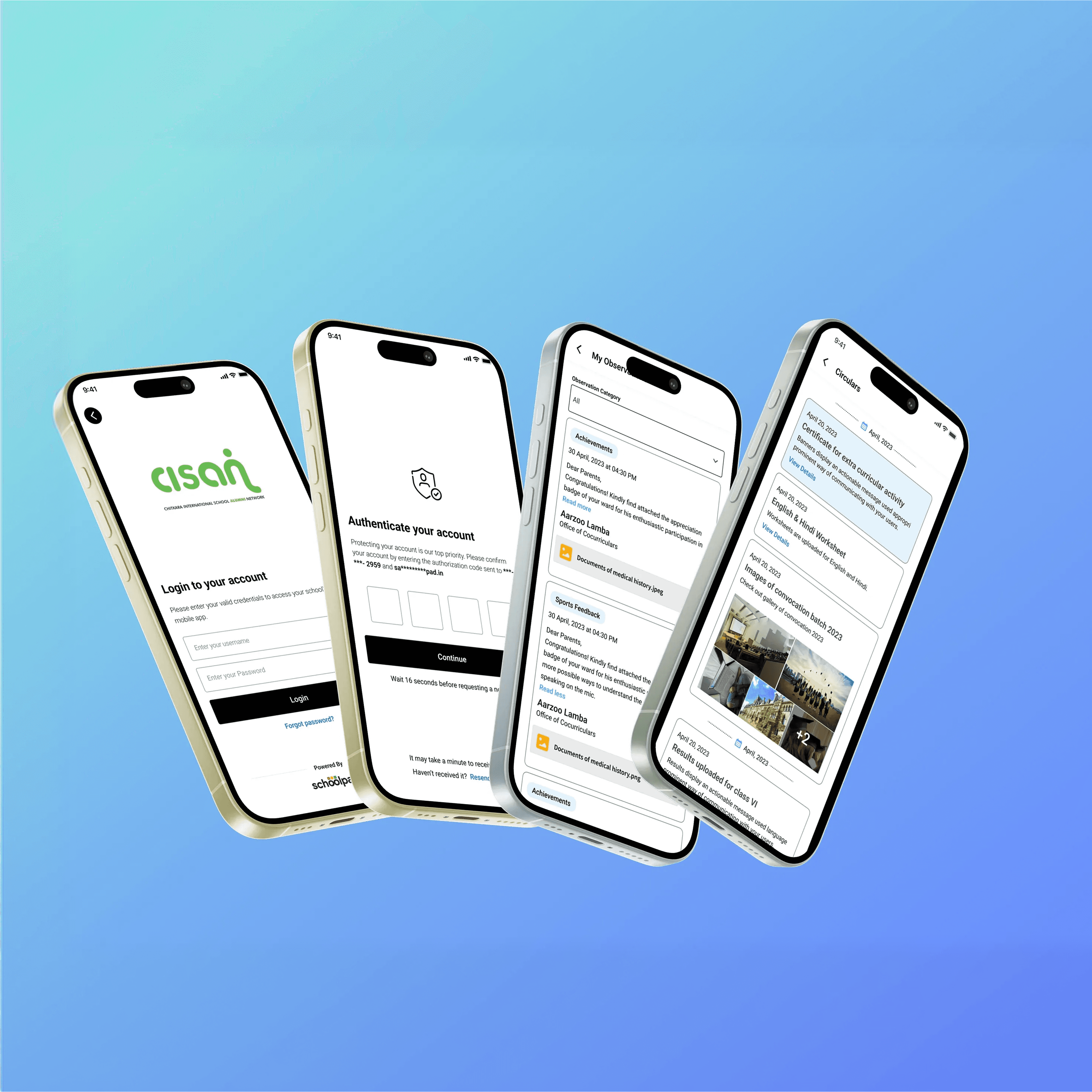
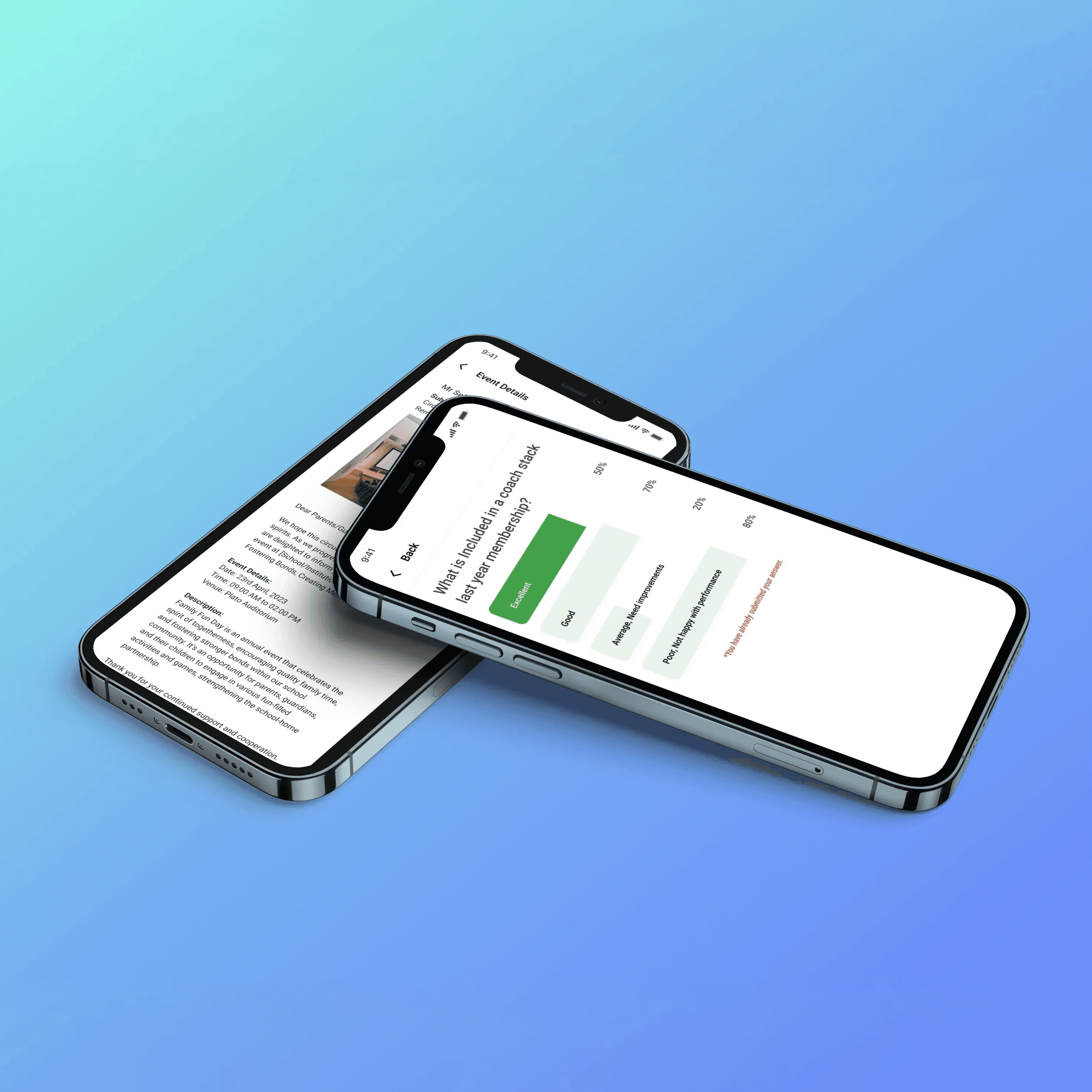
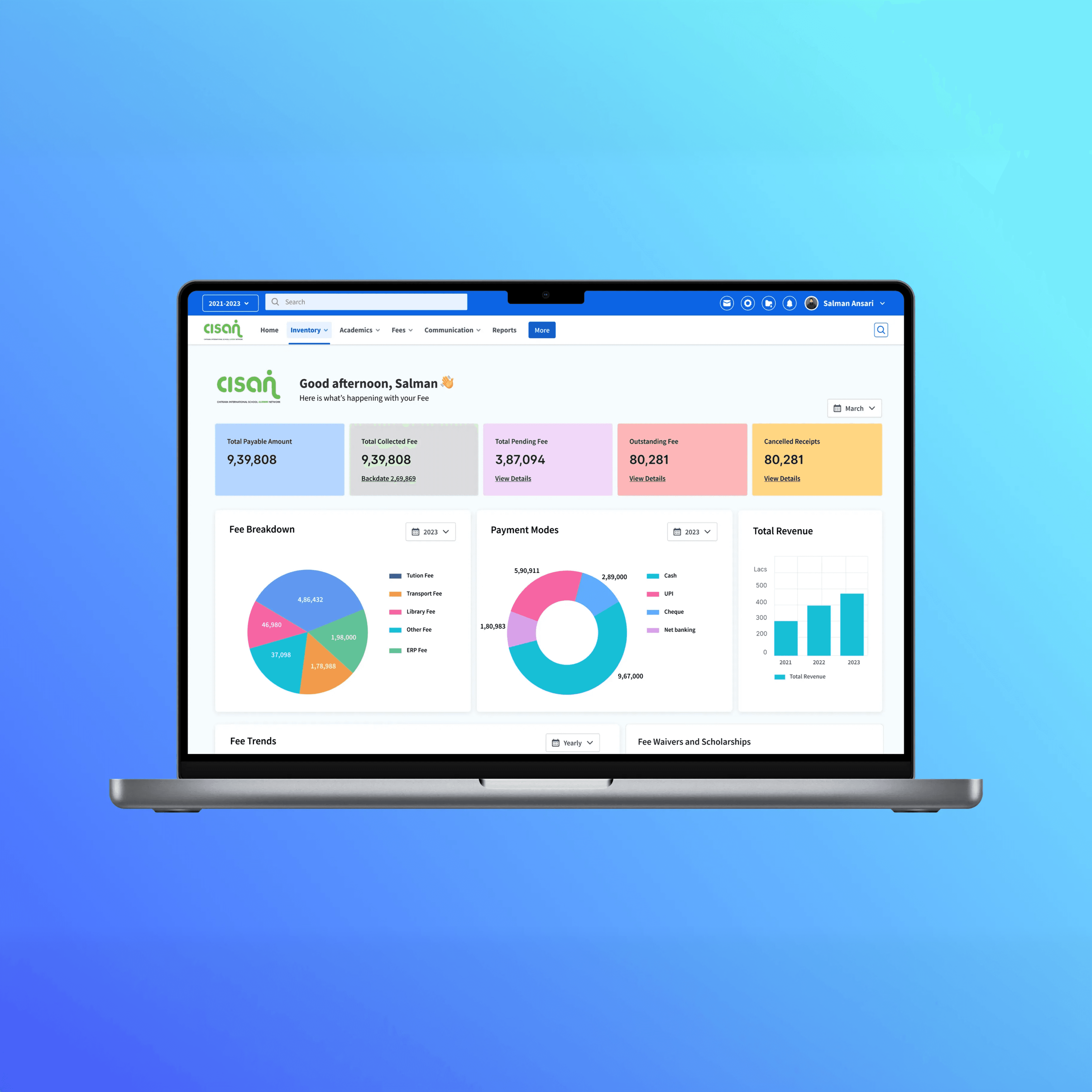
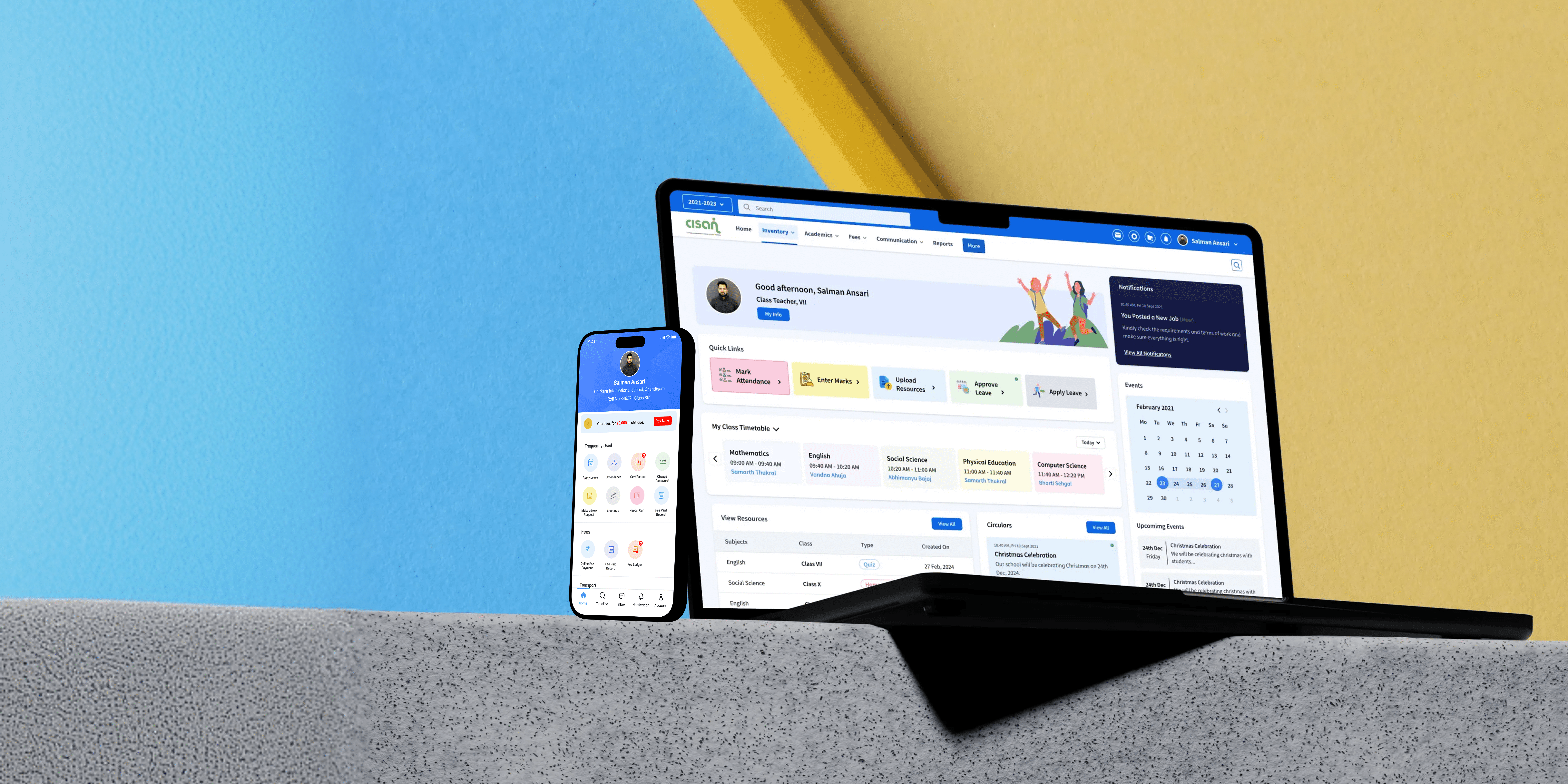
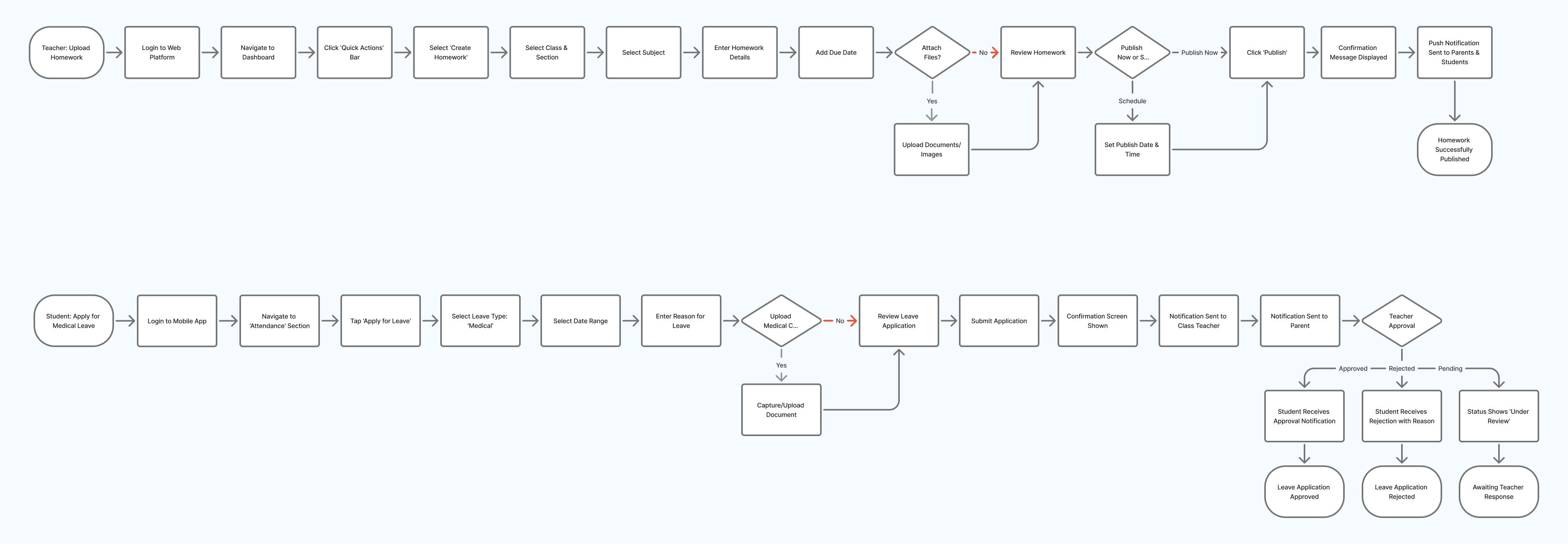
The UX strategy focused on role-based dashboards where each user saw only what mattered to them, supported by a simplified Atlassian-inspired navigation framework with clear primary menus and contextual actions. Critical workflows such as attendance, homework, lesson planning, fees, communication, and reports were redesigned to reduce steps, clarify actions, and improve task efficiency.
Ideation and Design Exploration
Multiple navigation models, dashboard card variations, and interaction patterns were explored to balance usability with system constraints. Weekly design–engineering syncs helped map feasibility within sprint cycles, evaluate trade-offs for legacy compatibility, and ensure design system compliance throughout exploration.
Interaction Design and UX Decisions
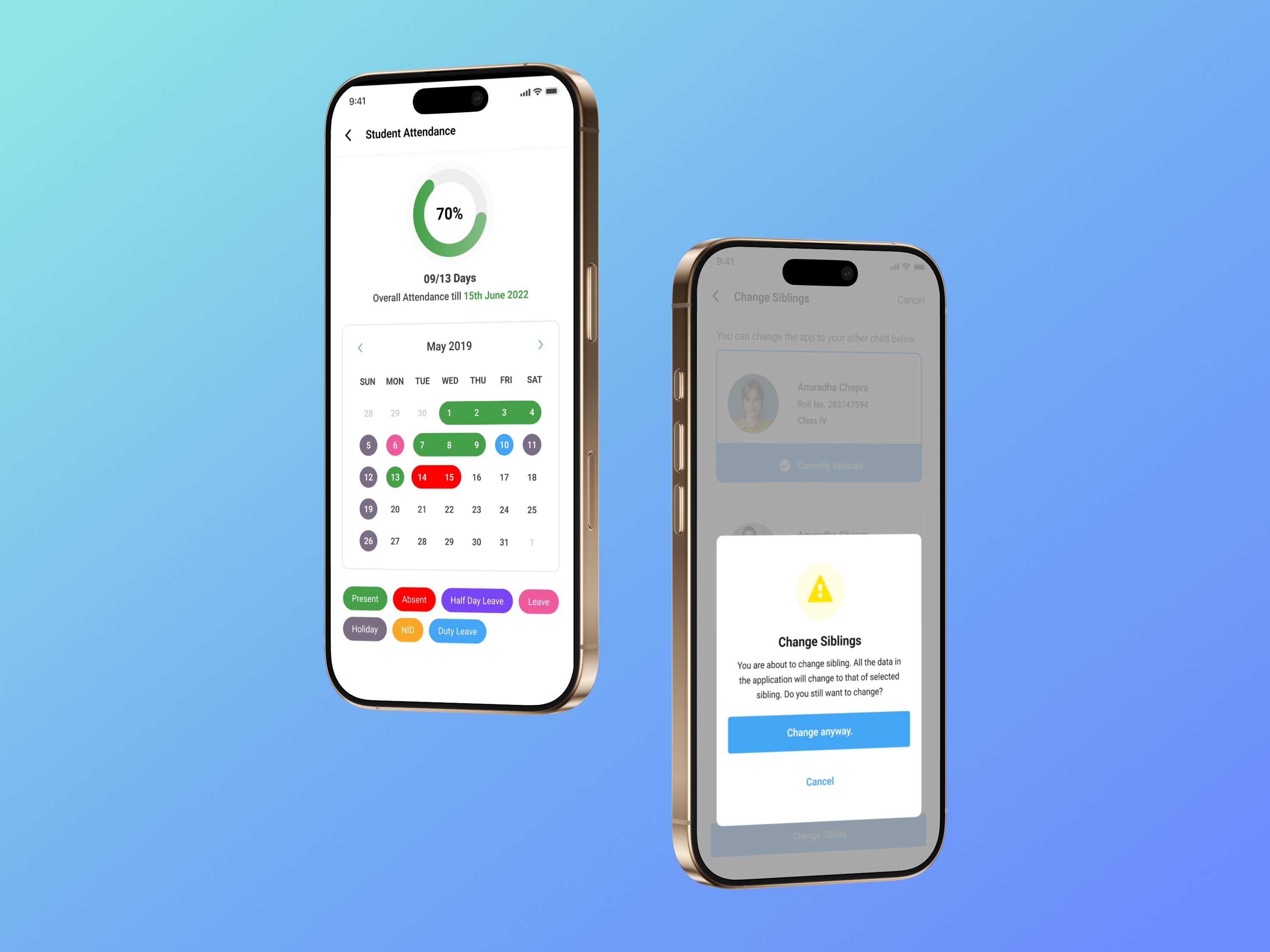
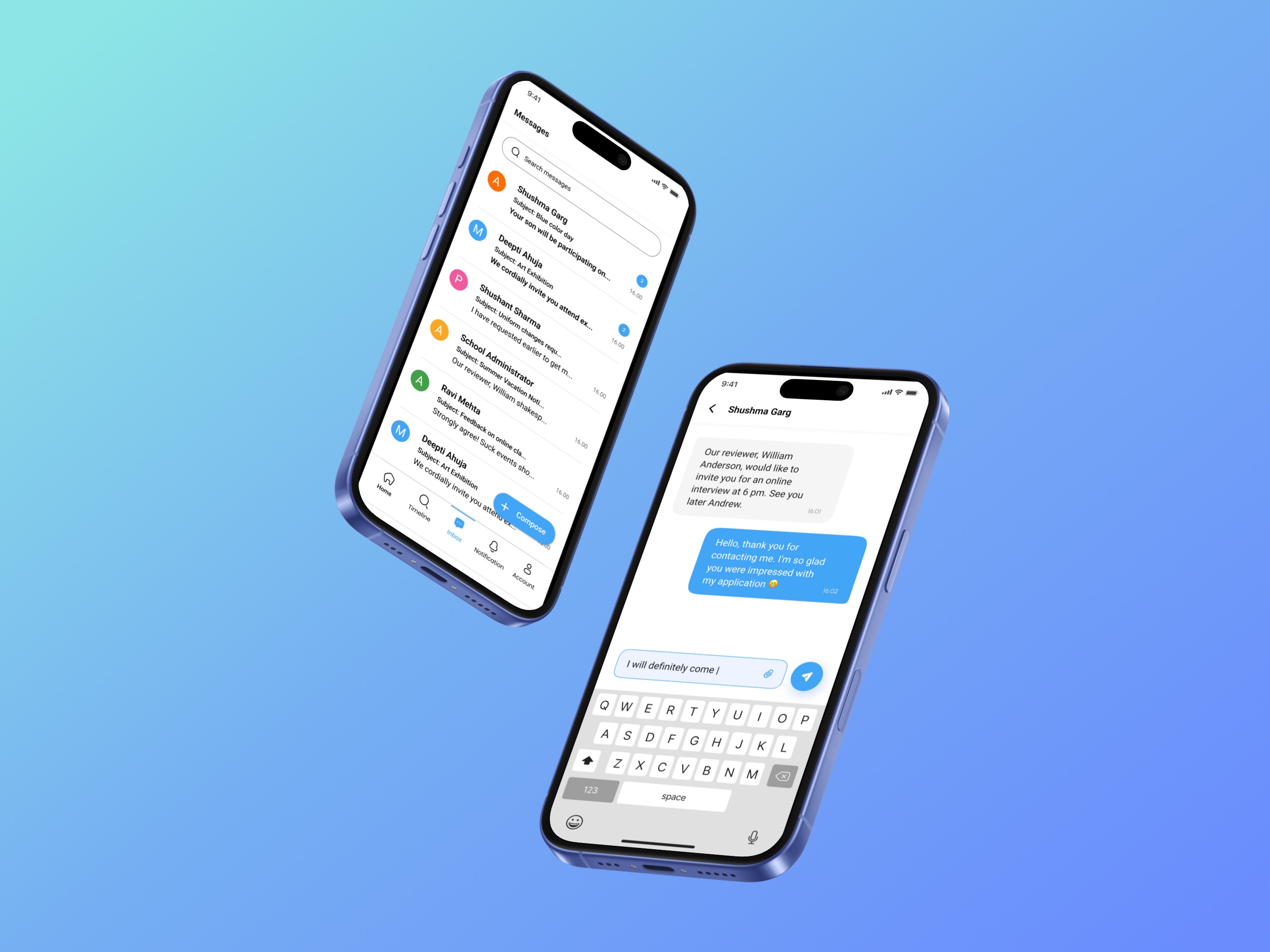
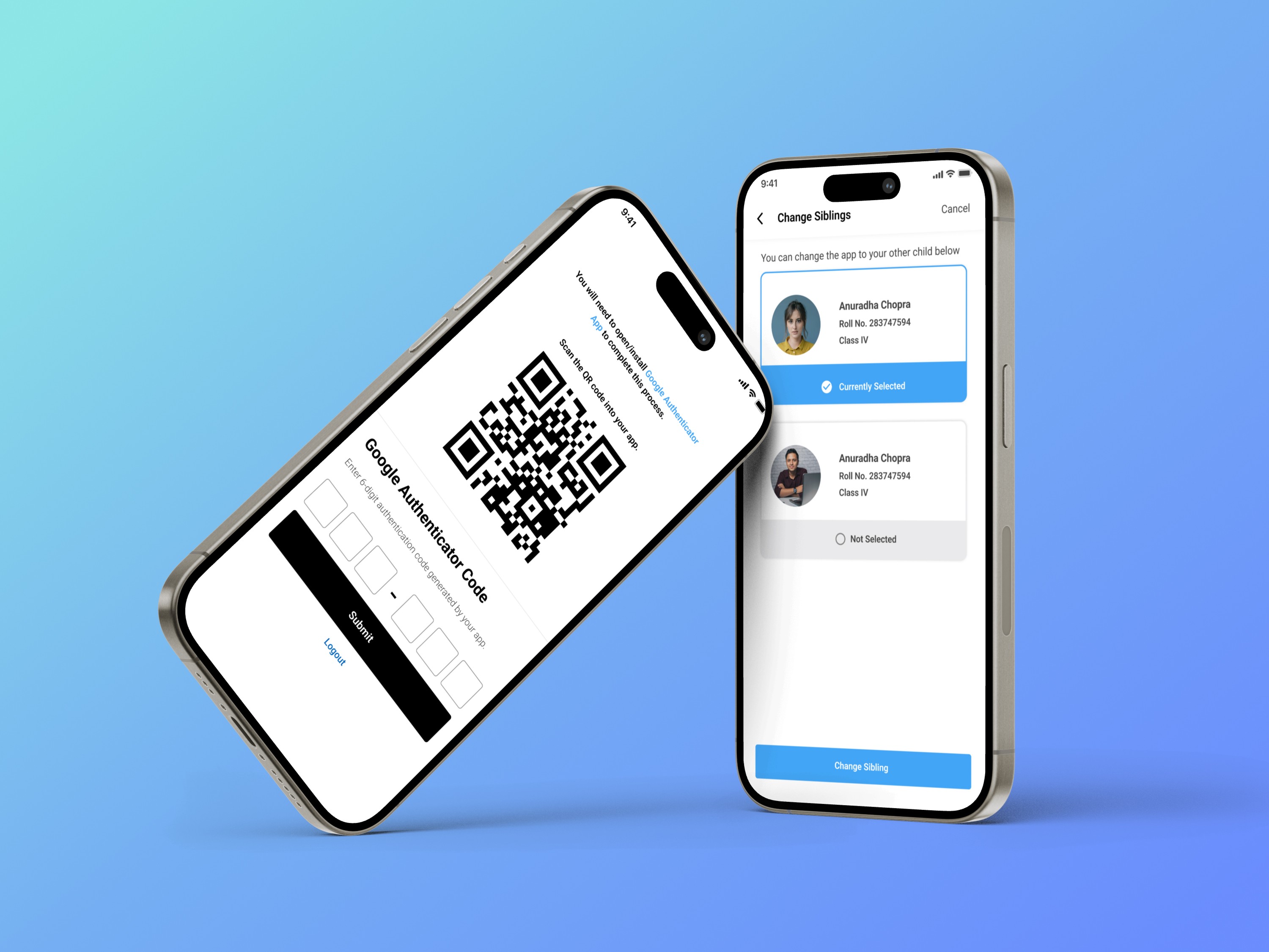
Key interaction decisions included separating “view” and “action” zones to reduce cognitive load, introducing contextual toolbars for faster task discovery, standardizing forms and tables using Atlassian foundations, improving readability through modern spacing and typography tokens, and adding micro-interactions for alerts, reminders, and submissions—especially in the mobile app.
Prototyping and Usability Testing
Moderated remote usability tests were conducted with teachers and admins, supported by internal testing from the support team and small parent testing groups for the mobile app. Feedback revealed excessive filtering on web screens, a strong preference for a parent home feed, and the need for quicker teacher actions, leading to iterative refinements across flows.
UI Design and Design System Integration
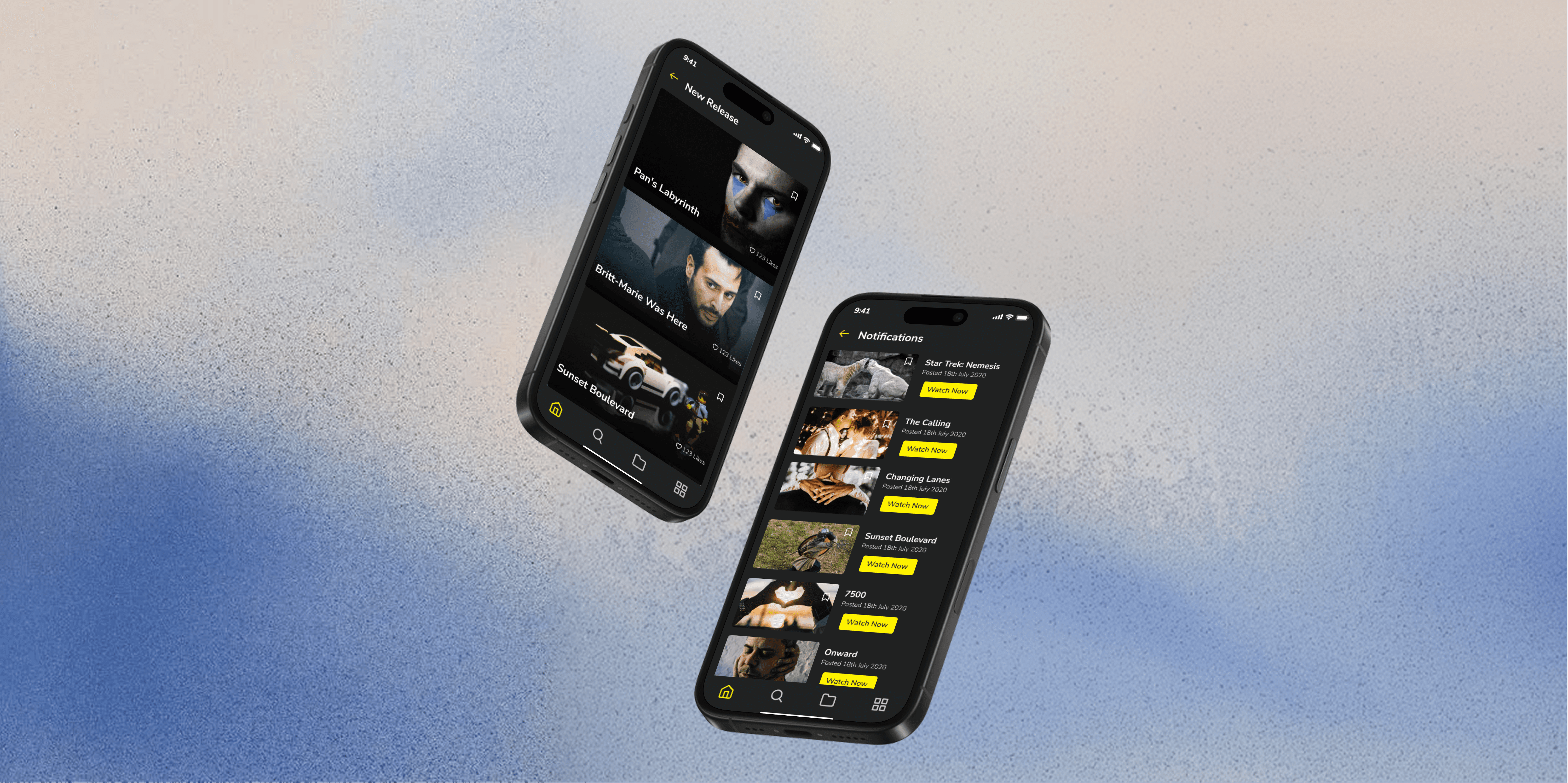
The Atlassian Design System was used as the foundation to ensure consistency, scalability, and reduced engineering overhead. Design tokens for typography, spacing, elevation, and color were introduced, alongside card-based dashboards, modernized tables, and mobile-first layouts for parent and student experiences.
Final Solution
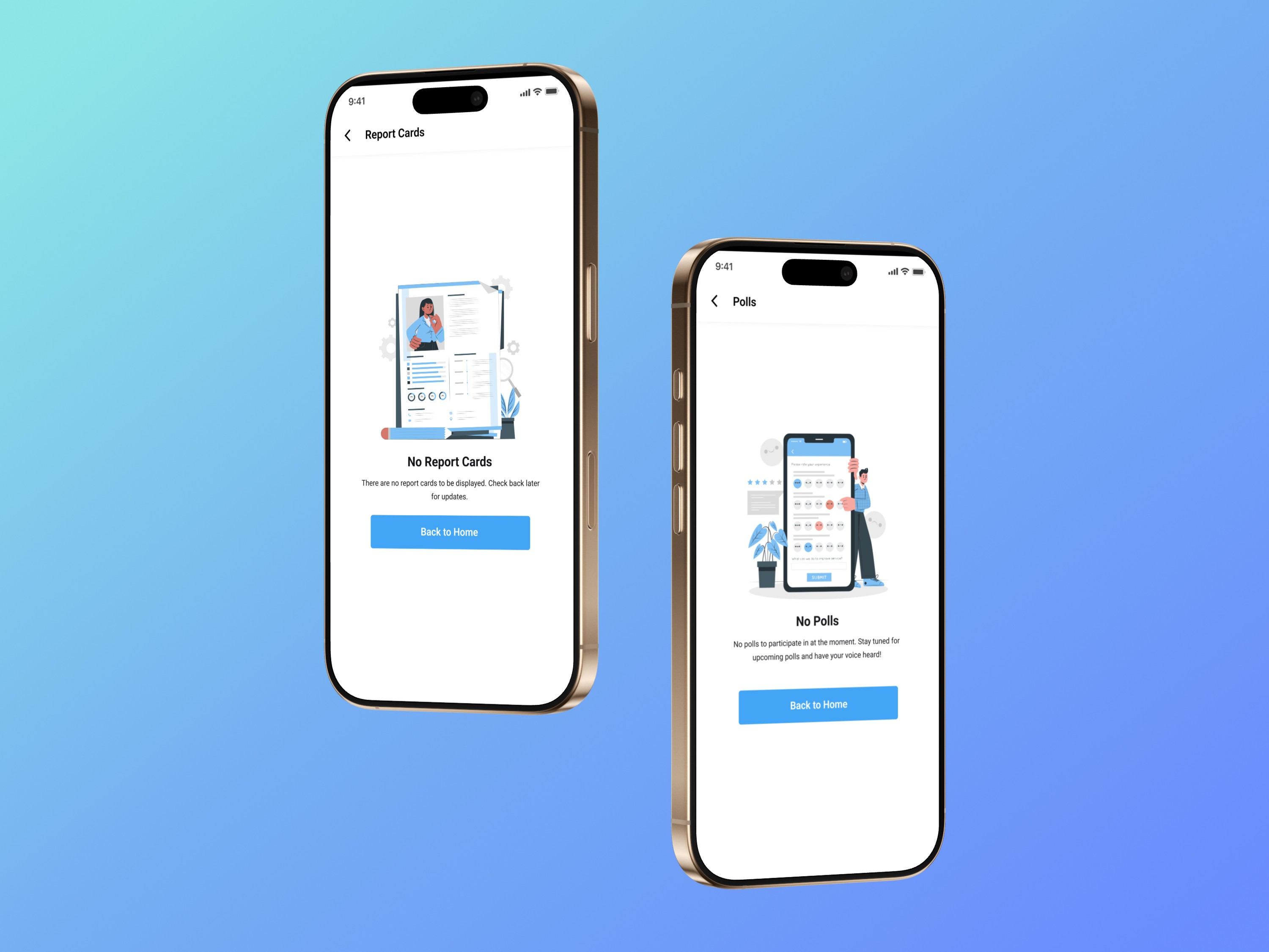
The final solution delivered clean, structured dashboards, improved information architecture, and streamlined workflows across the web platform, while the mobile app focused on a parent-first experience with strong notifications, simplified daily overviews, and improved readability for younger users.
Impact and Outcomes
The redesign resulted in faster task completion for teachers, fewer support tickets from parents, higher daily active usage, improved teacher adoption, and reduced onboarding time for new schools. Qualitative feedback highlighted simplified daily workflows for teachers, easier access to reports for admins, and clearer, more organized experiences for parents.
Reflections and Learnings
This project reinforced that B2B2C systems require deeply role-based mental models, that legacy redesigns demand a balance between innovation and constraint, and that design systems like Atlassian can significantly accelerate scalability and engineering alignment. It also emphasized that multi-platform alignment requires distinct UX logic for each platform and that real user feedback is the most valuable driver of meaningful design decisions.