Preview Figma
Year
2023
Client
Chitkara University
Overview
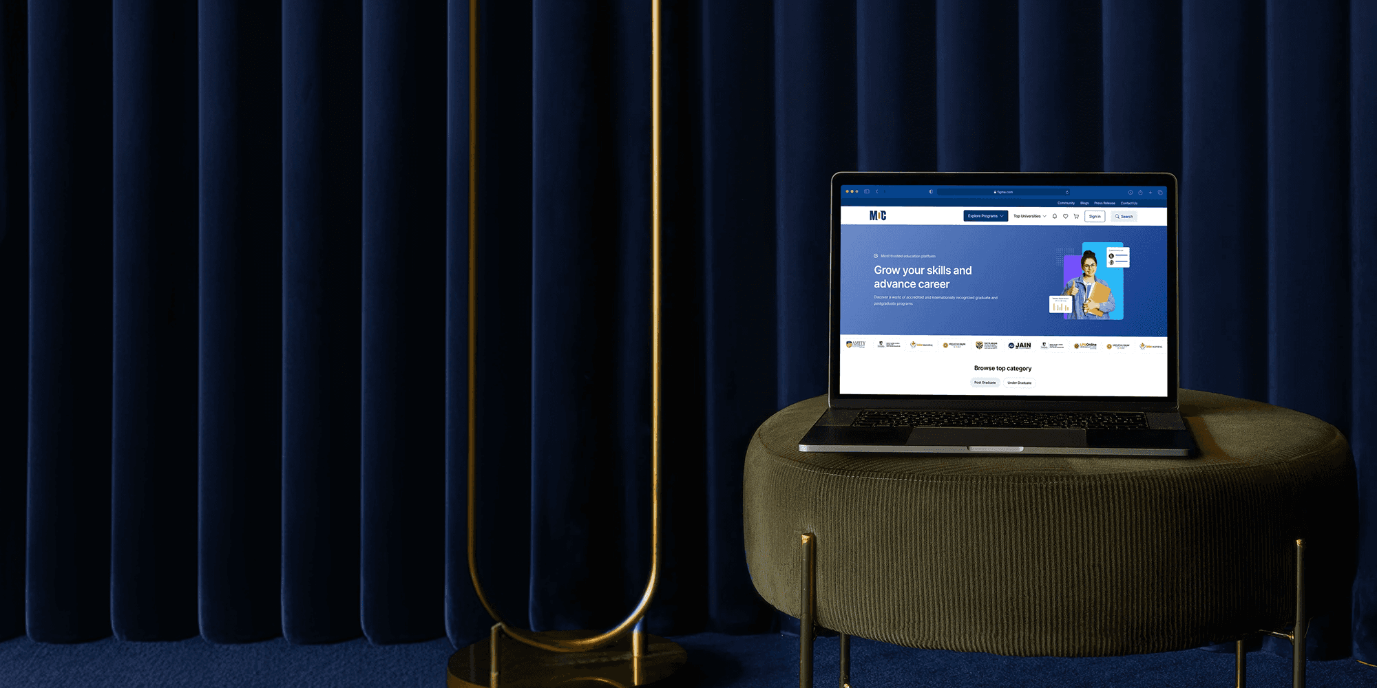
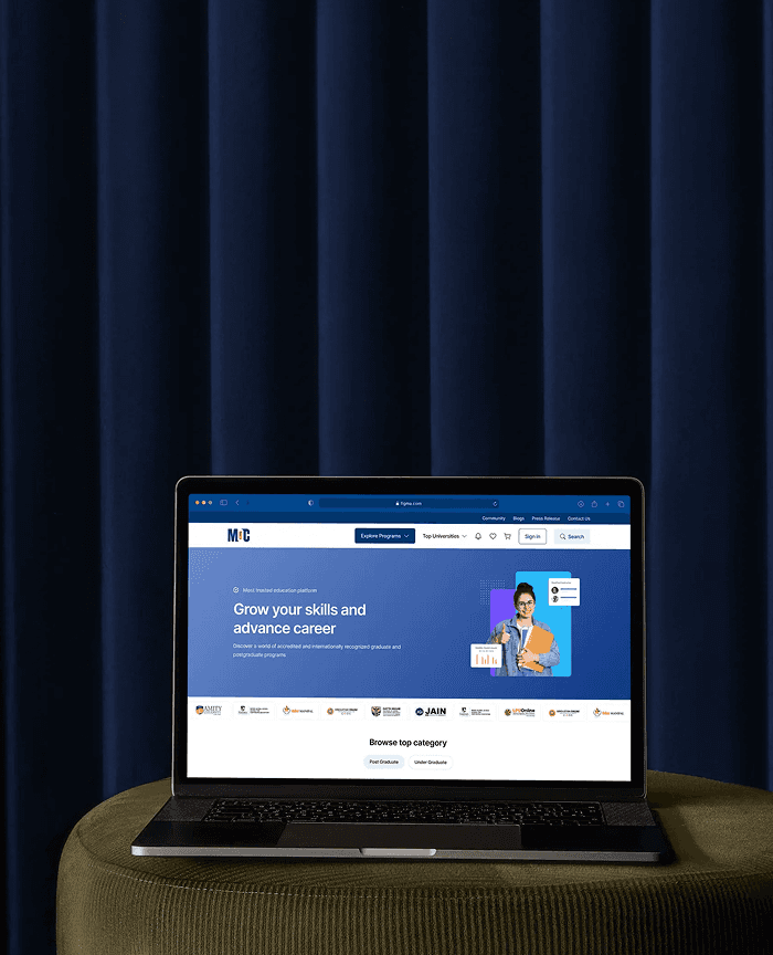
My Online College aggregates accredited online programs, but users often arrive skeptical and overwhelmed. As the lead UX/UI designer, my role was to design trust first—then optimize for conversion.
I structured the IA for guided discovery, designed comparison-friendly course cards, and built course detail pages as decision-support tools with clear outcomes, fees, and accreditation signals. Mobile-first design was critical due to high traffic from ads and search.
The platform now delivers clarity, credibility, and strong conversion performance, helping users confidently choose programs and helping partner colleges generate higher-quality leads.
Context & Problem
The primary challenge was building immediate trust in a highly competitive online learning space where users are often skeptical about legitimacy and recognition. At the same time, the platform needed to simplify discovery across thousands of courses for users who were unsure of what program suited them, while ensuring that every page—from homepage to course detail—was optimized to drive conversions with minimal friction.
Role & Research
As Lead UX/UI Designer, I focused on trust signals, guided discovery, and conversion optimization across the platform. Research showed that the platform served working professionals, students, parents, and learners seeking recognized degrees without relocation. Across all groups, users valued flexibility, credibility, easy comparison, and clarity around fees, duration, accreditation, and outcomes. Key pain points included overwhelming choices, difficulty comparing programs, unclear course structures, and excessive academic jargon that slowed decision-making.
UX Strategy
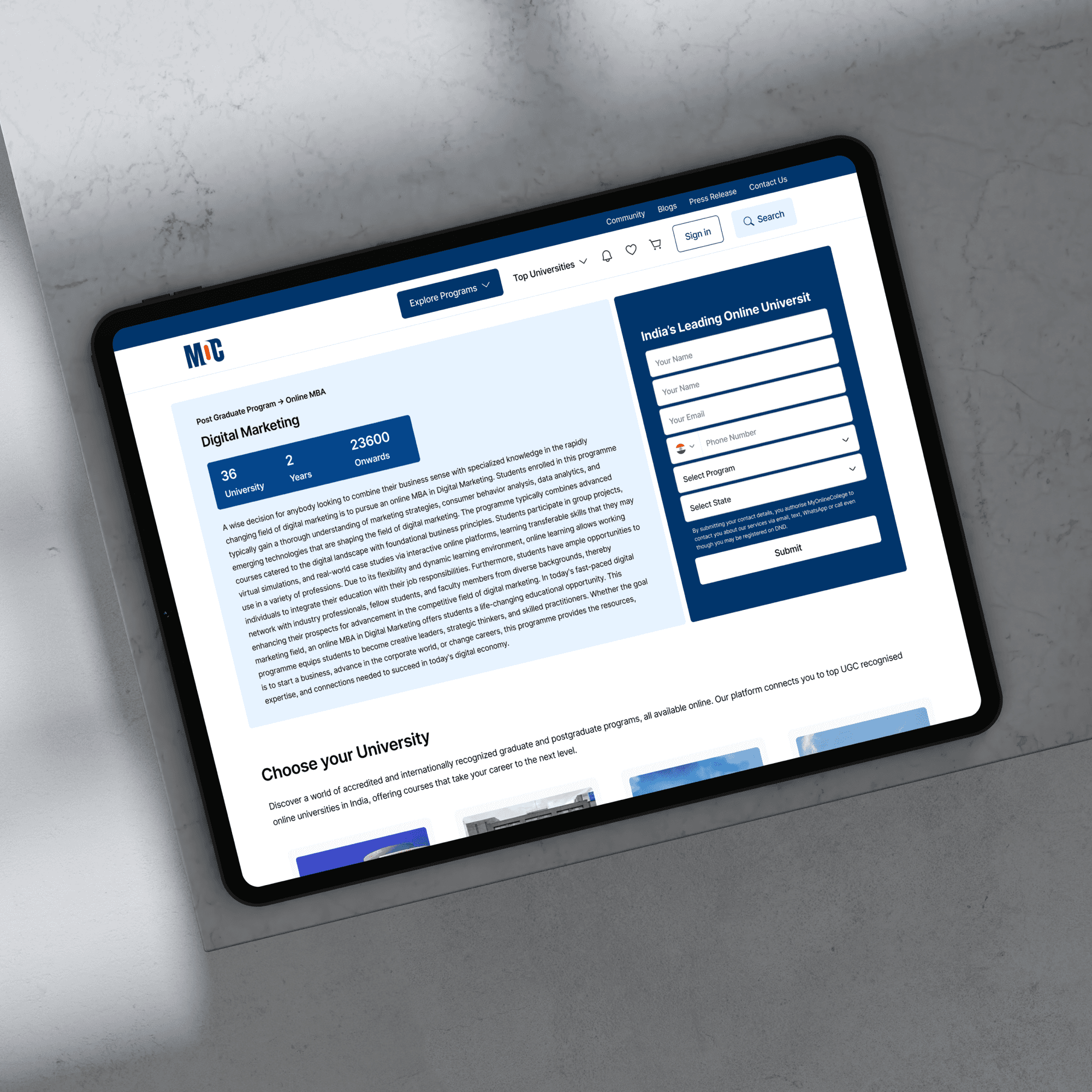
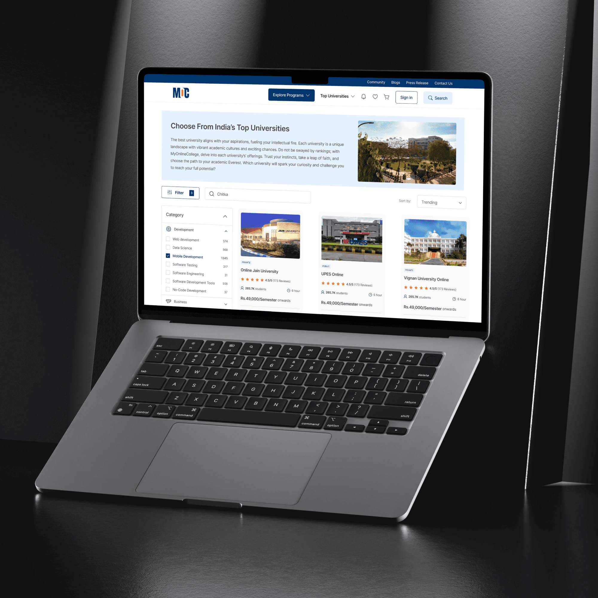
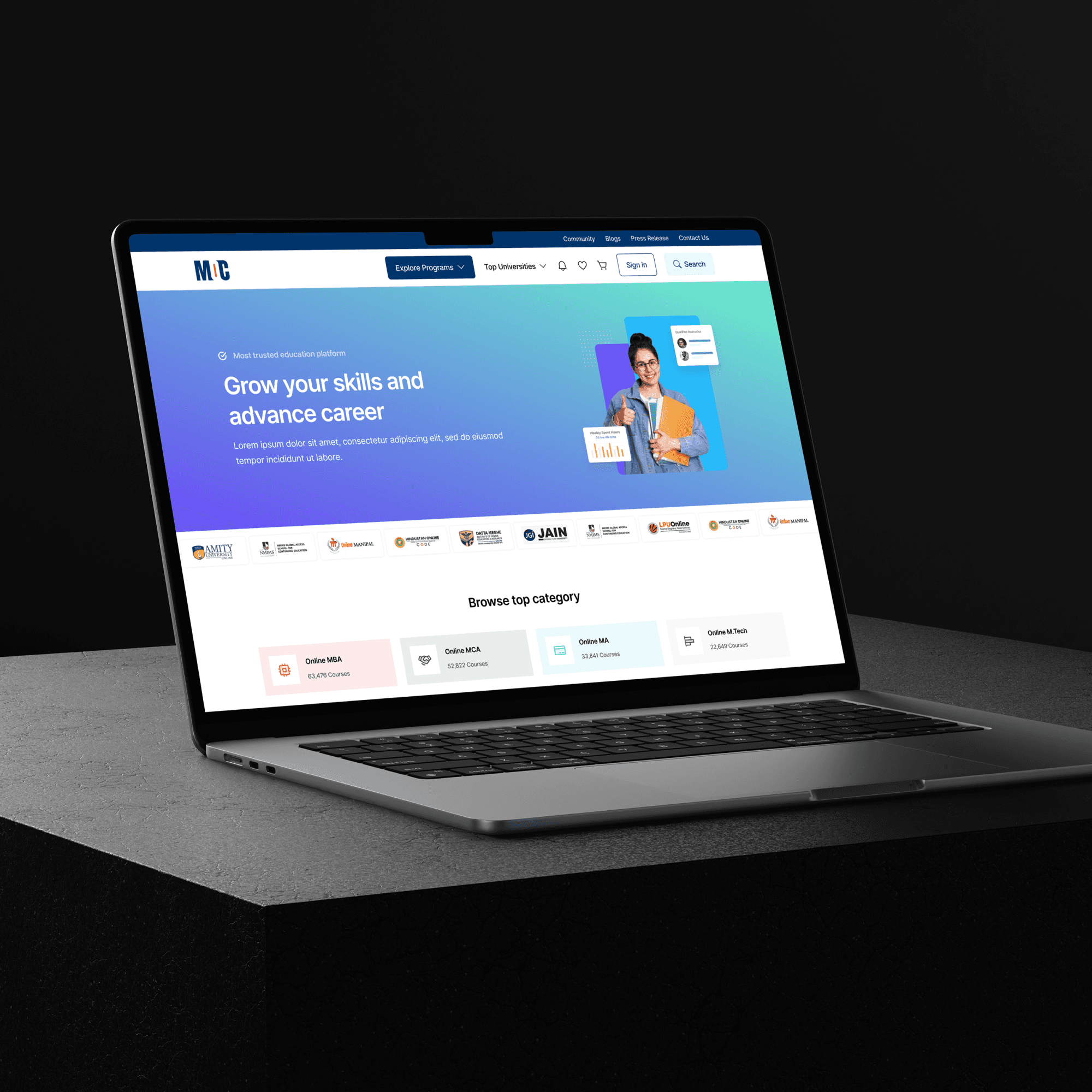
The UX strategy followed a clear principle: establish trust before asking for conversion. Credibility elements such as university logos, accreditation badges, rankings, and success stories were surfaced early and consistently. Course discovery was designed as a guided funnel—moving from discipline to degree type, duration, fees, and learning mode—to reduce cognitive load and help users make faster, more confident decisions.
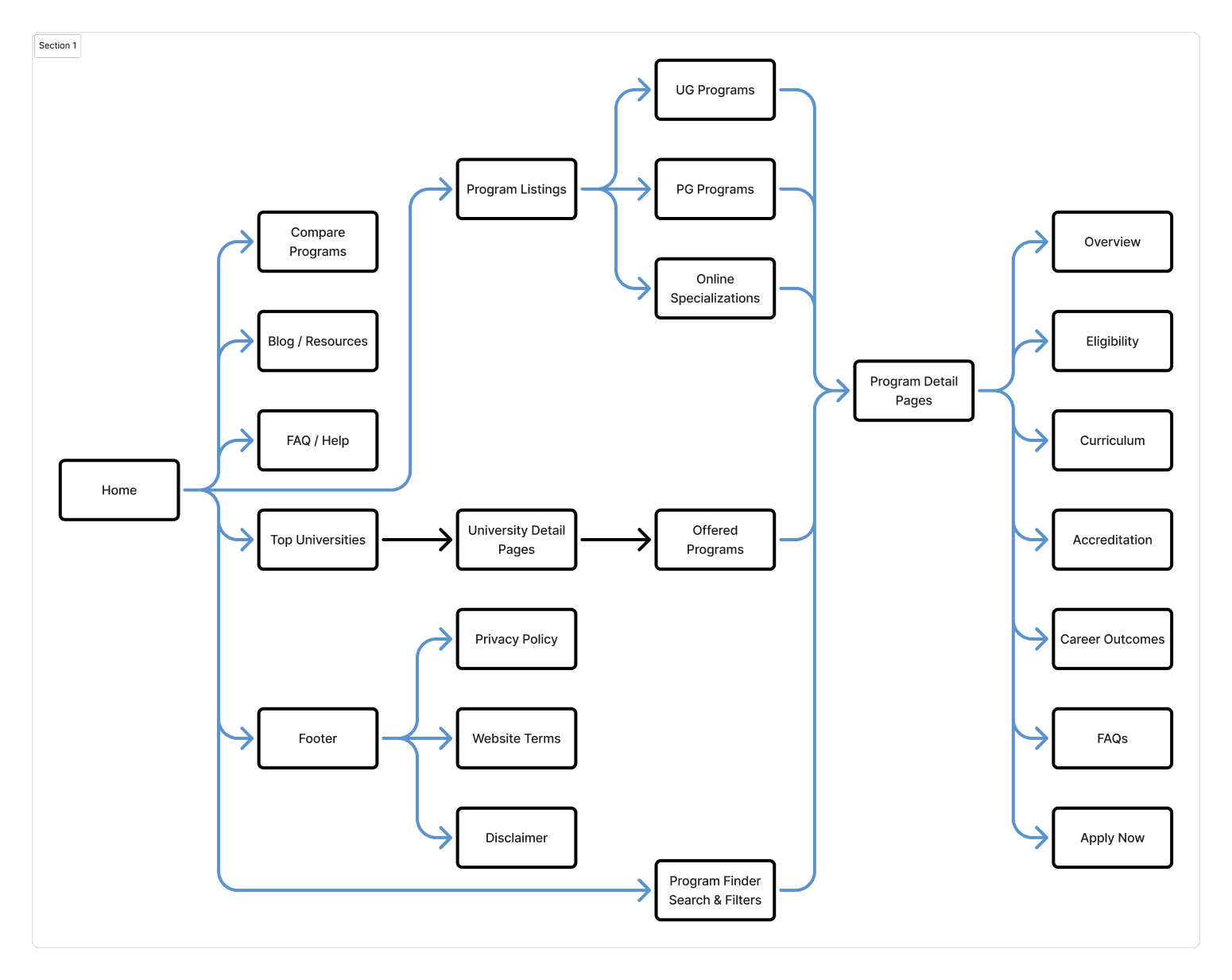
Information Architecture
The information architecture was intentionally simple and optimized for fast exploration. Core sections included Home, Explore Colleges, Explore Courses, Compare Programs, Why Online Learning, Success Stories, FAQ, and Apply or Enquire. Each section was designed to reduce friction, support decision-making, and guide users naturally toward conversion.
Solution and Impact
The final platform delivered a strong and trustworthy first impression, an intuitive and guided exploration experience, seamless program comparison, and highly optimized conversion-focused pages. The UI was modern, clean, and aligned with user expectations, while the underlying design system was scalable enough to support hundreds of colleges and programs.
The platform improved lead quality, reduced bounce rates, and increased engagement with apply and enquiry CTAs.