Preview Figma
Year
2025
Client
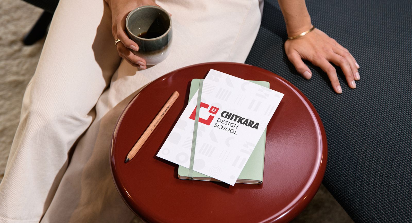
Chitkara University
Project Overview
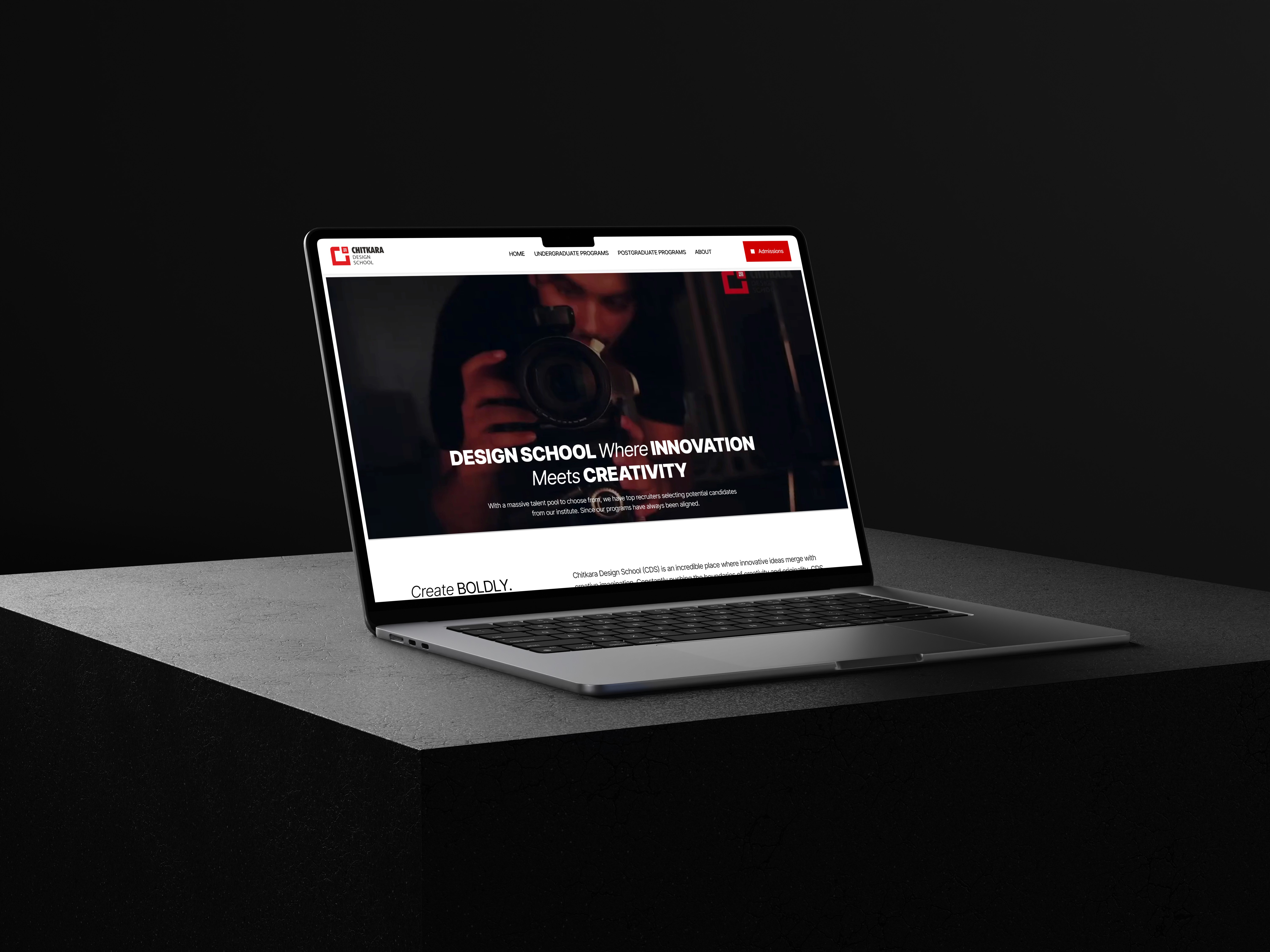
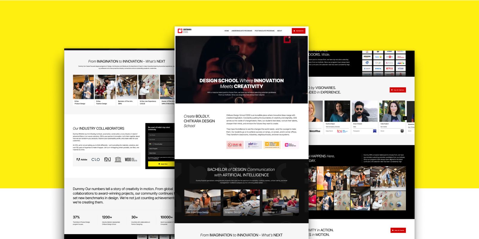
Chitkara Design School needed a completely refreshed website that celebrates creativity while maintaining the academic seriousness of a premier university. The existing site suffered from fragmented UX, inconsistent UI, weak branding, and low conversion clarity.
My role involved crafting a vibrant new design direction, redesigning key UX flows, establishing a micro–design-system unique to the school, and ensuring development feasibility.
The Challenge
The key challenge was introducing a bold, playful, and creative identity without breaking Chitkara University’s established red–black–white brand system. The site also needed to balance expressive visuals with professional credibility to appeal to both design aspirants and parents. Additionally, major UX issues such as poor hierarchy, cluttered layouts, unclear CTAs, and confusing navigation had to be resolved while retaining the functional goals of program discovery, admissions routing, and conversion optimization.
Research and Insights
The primary users included undergraduate and postgraduate design aspirants from Gen-Z, their parents, faculty members, and creative professionals exploring academic pathways. Students were primarily seeking inspiration, clarity, and creative identity, while parents focused on credibility, outcomes, and placements.
Competitive benchmarking was conducted across leading design institutions such as NID, Pearl Academy, MIT-ID, Srishti, RMIT, and Parsons. Common patterns observed included bold typography, immersive hero sections showcasing student work, expressive color palettes, playful micro-interactions, and modular layouts that still maintained academic structure.
User testing on the old website revealed multiple pain points, including poorly grouped content, unclear navigation structure, weak storytelling, inconsistent visual hierarchy, lack of program differentiation, and minimal motivation to engage with “Apply” CTAs.
UX Strategy
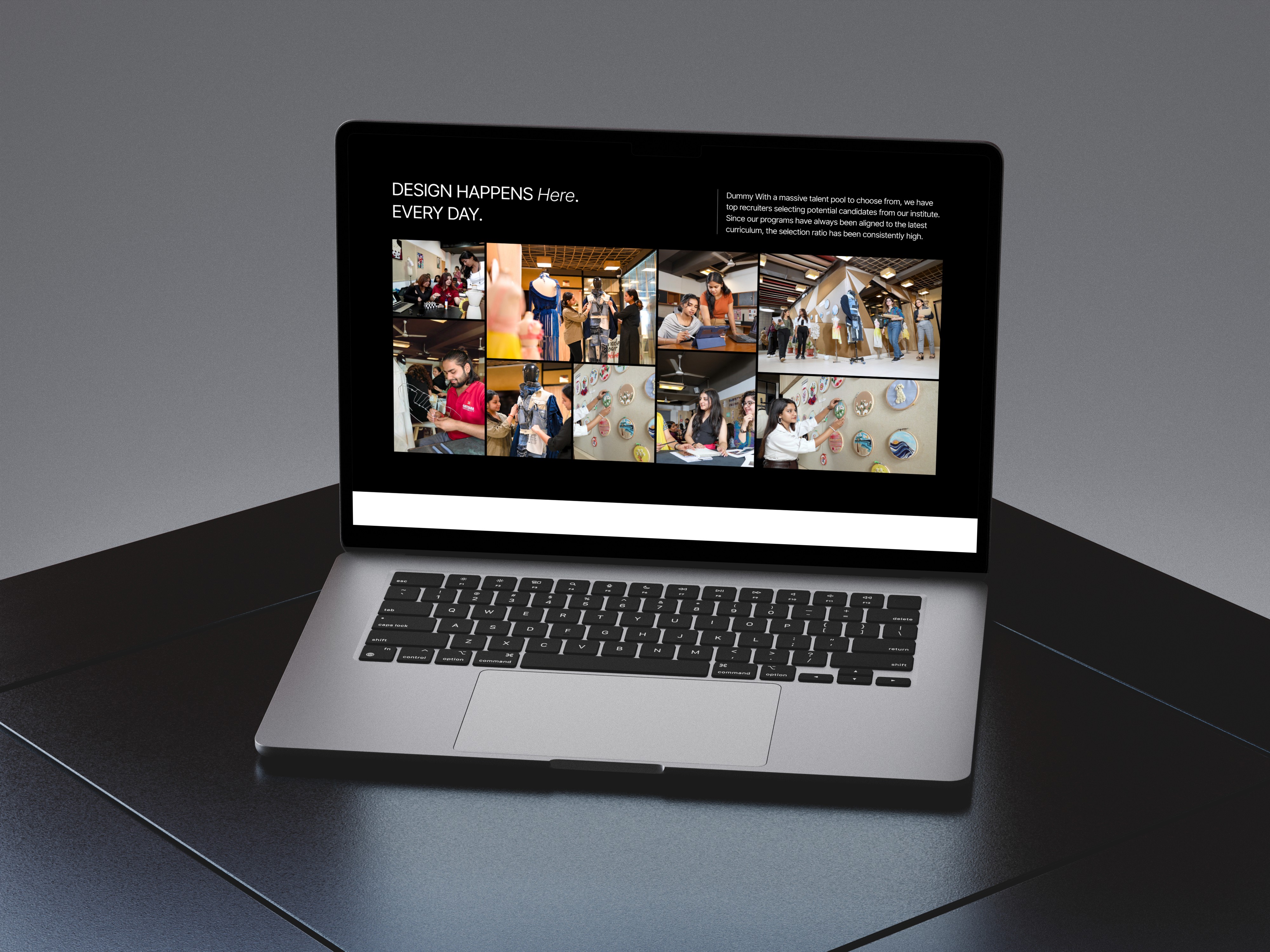
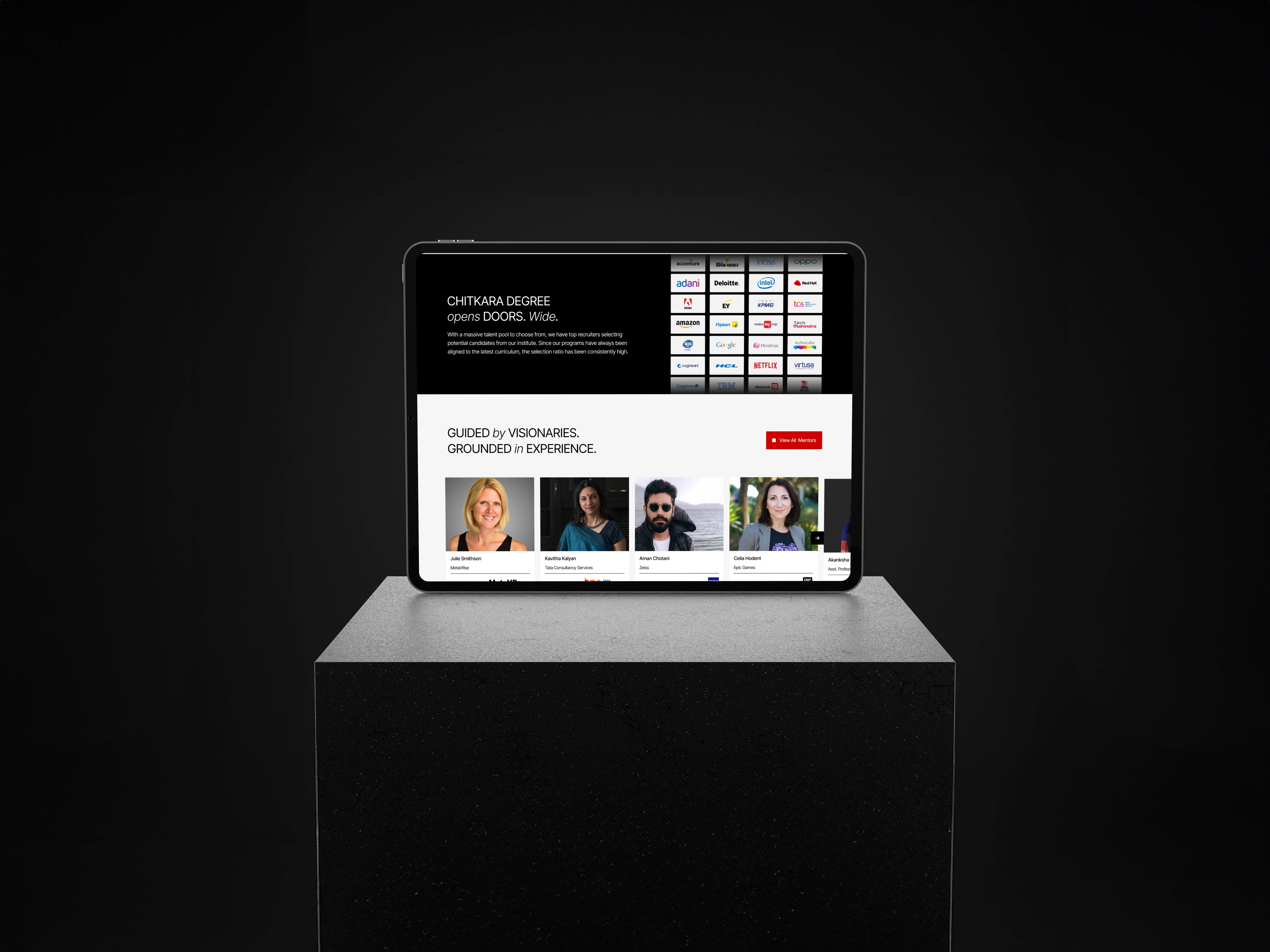
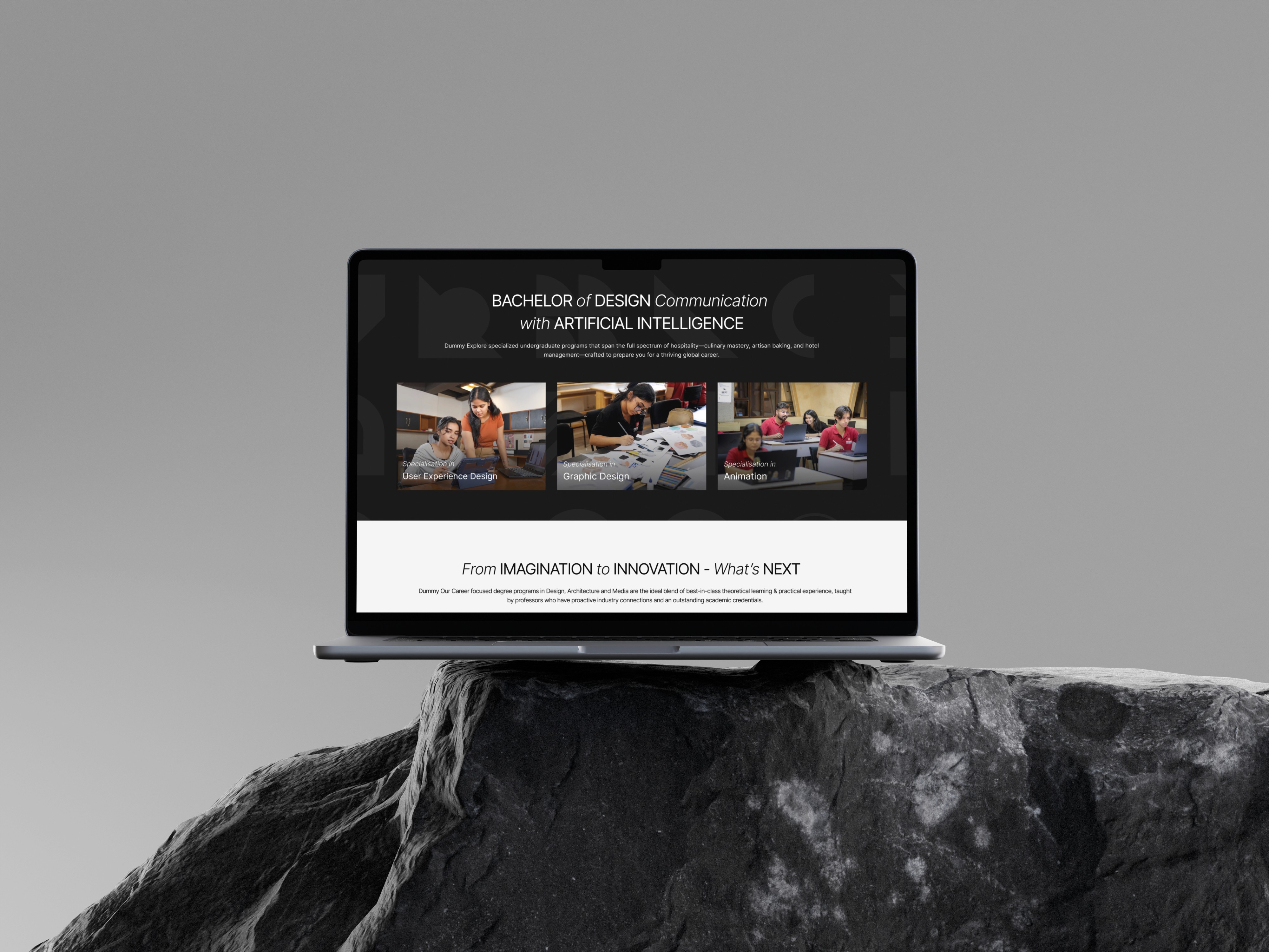
The UX strategy focused on creating a bright, youthful, studio-like experience supported by a clear and structured information architecture. Programs, admissions, student work, faculty, and infrastructure were reorganized into intuitive flows with improved content hierarchy. Strong storytelling sections highlighted student life and creative culture, while sticky CTAs and simplified admissions journeys ensured that creativity never compromised conversion goals. Subtle micro-interactions added personality without affecting usability or performance.
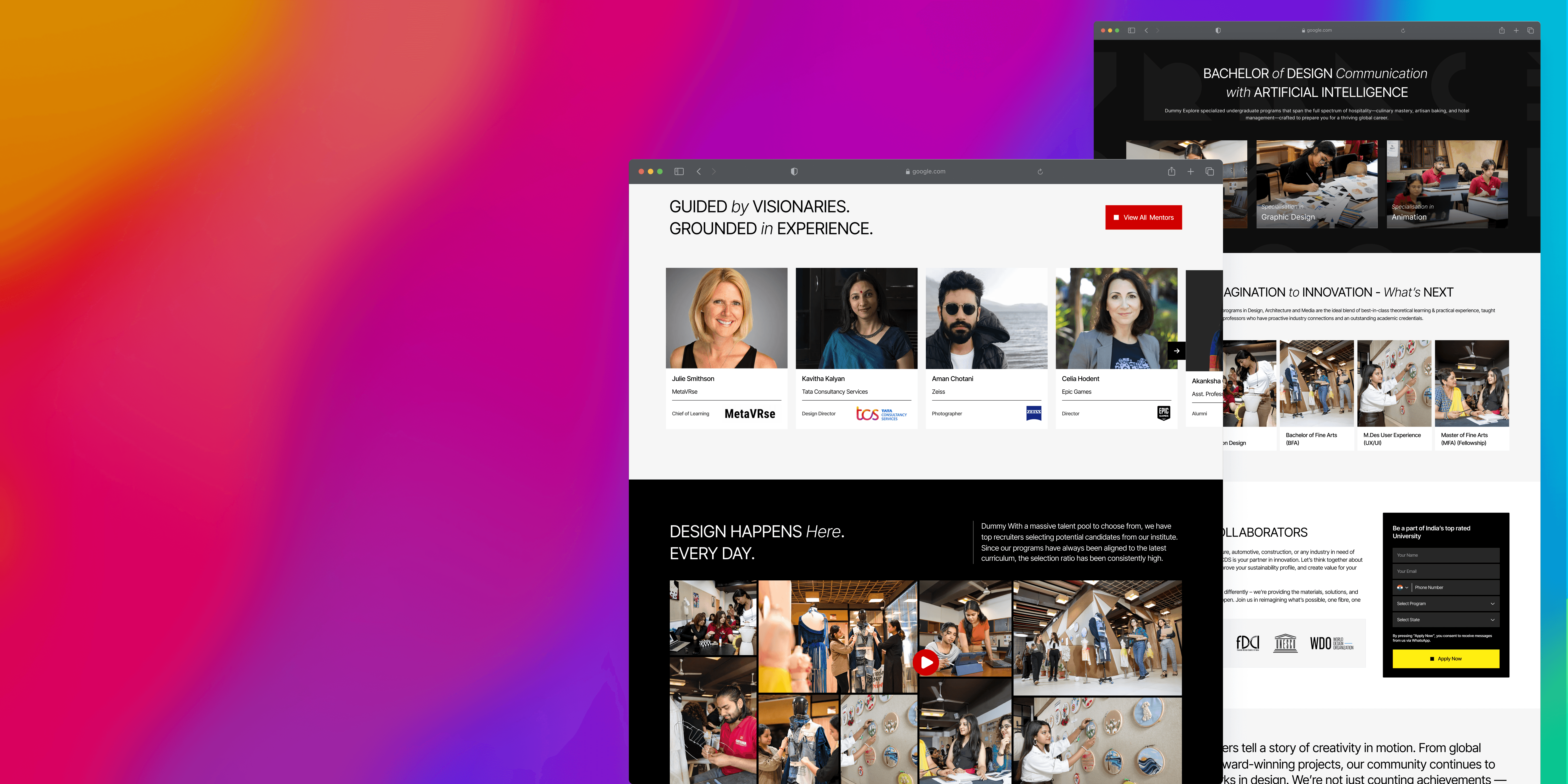
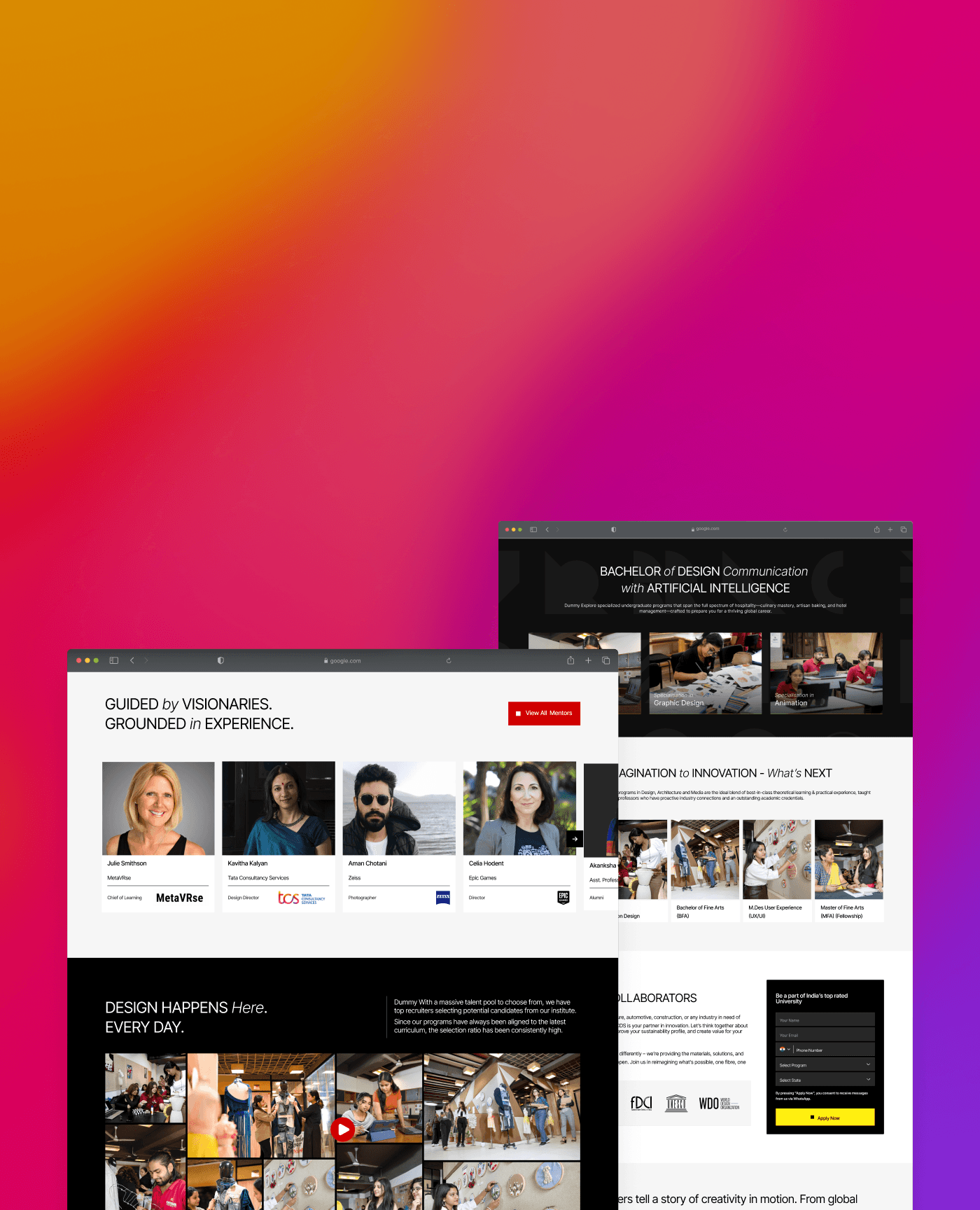
Visual Direction and UI System
Color Palette – Expanding Beyond Red/Black/White
We introduced a secondary creative palette in controlled ways: yellows, blues, greens, and pastel accents—strictly moderated to maintain academic tone. These colors served functional purposes (section separation, highlights, navigation clarity).
Typography – Bold + Friendly
Heading fonts were chosen to feel modern & expressive, while body text remained clean and academic. This dual-typography system balanced creativity with professionalism.
Component Library
We developed reusable elements:
Program cards
Showcase carousels
Image grids
Feature blocks
Animated hero sections
Sticky CTA patterns
Creative Layout Patterns
Layouts used broken grids, overlapping elements, asymmetry, and generous whitespace—giving the site a “design school” personality without sacrificing readability.
UX and IA Improvements
Program discovery was rebuilt so each course clearly communicated curriculum, eligibility, labs, career outcomes, and student work, helping users compare creatively driven programs with confidence. The admissions flow was simplified with clearer steps, dedicated hubs, and mobile-first layouts. Student portfolios and projects were placed at the center of the experience to boost authenticity, while faculty and lab pages were redesigned to feel more visual, engaging, and aspirational.
Role & Responsibility
I led UX and UI redesign, defining a creative yet structured visual language, rebuilding IA, and establishing a micro design system unique to the design school.
Development Collaboration
We collaborated closely with developers to implement animations, grids, and creative elements without harming performance. Provided detailed component specs, motion guidelines, design tokens, and breakpoints for every layout.
Used asset compression, lazy loading, and optimized SVG interactions to ensure speed on mobile devices.
Final Result
The newly redesigned Chitkara Design School website feels creative, premium, youthful, and academic—a perfect match for design aspirants. It stands apart from all other Chitkara sub-sites with its bright theme, expressive visuals, and engaging interactions, while maintaining strong UX clarity and conversion focus.
Impact
The new site differentiated the Design School clearly, increased engagement, and created a strong emotional connection for prospective students.
Reflections
This project reinforced the nuances of designing for creative education—balancing bold expression with structured academic information. It showcased the importance of storytelling through visuals and highlighted the power of design systems when dealing with multi-site university ecosystems.