Preview Figma
Year
2025
Client
Chitkara University
Project Overview
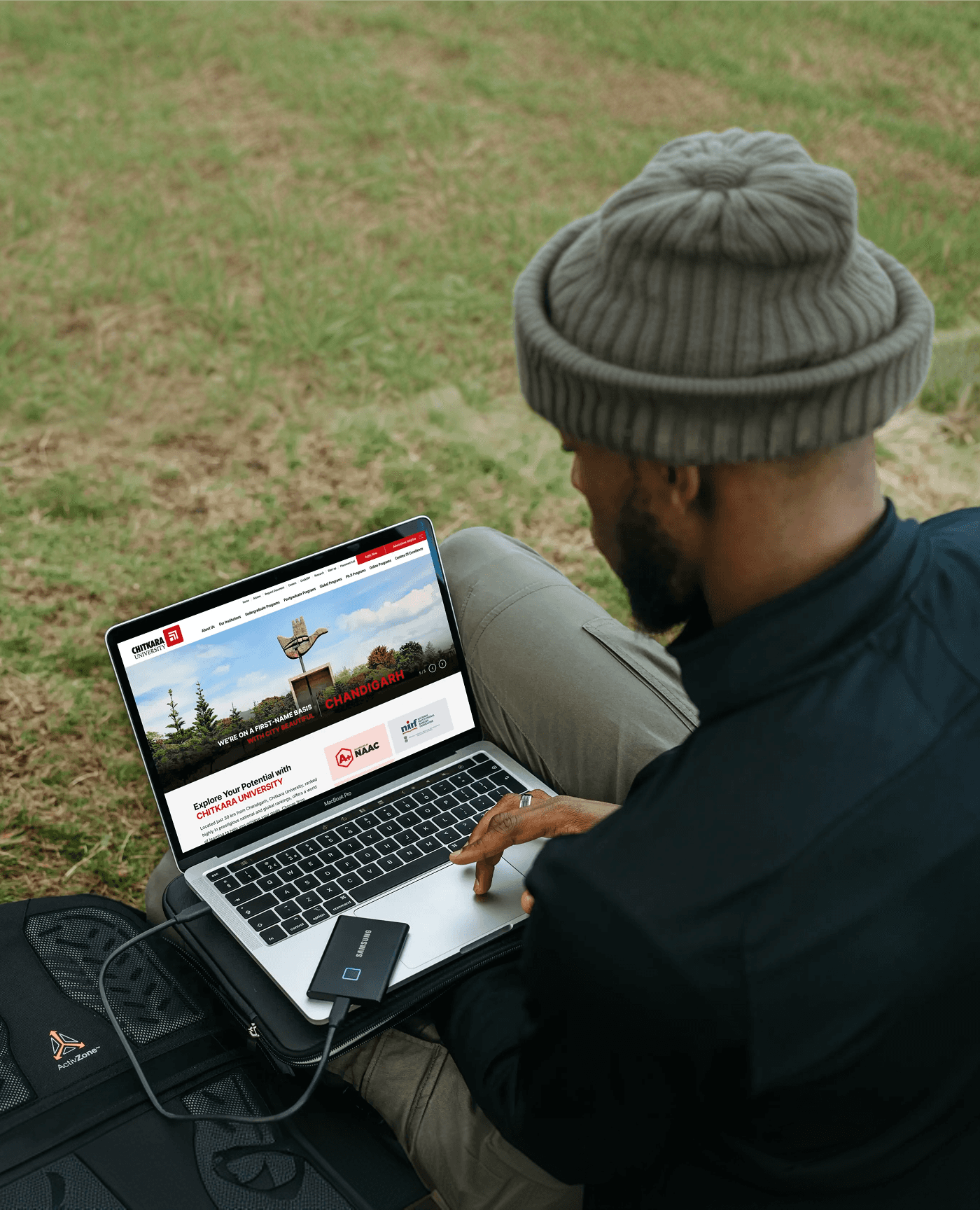
Chitkara University required a complete redesign of its public-facing website to support UG, PG, and PhD aspirants with a modern, intuitive, and high-performing experience. The existing site was content-heavy, visually inconsistent, difficult to navigate, and struggled during high-traffic admission periods. As the Senior Product/UX Designer, I led strategy, UX, UI, and system design, collaborating with marketing, admissions, engineering, content, SEO, brand, and DevOps teams to improve navigation, program discovery, conversions, scalability, and brand consistency.
The Challenge
The website faced multiple challenges including information overload from hundreds of programs and pages, high conversion drop-offs due to difficulty finding eligibility, fees, placements, and CTAs, performance instability during admission seasons, outdated and inconsistent UI due to the absence of a design system, and poor mobile optimization despite most Gen-Z users browsing on smartphones.
Discovery and Research Process
The project followed a tightly collaborative model with weekly syncs, feasibility reviews, and detailed component documentation. Performance was a core focus, with lazy loading for heavy sections, image compression, caching strategies, CDN usage, code splitting, and static pre-rendering to ensure fast load times and stability during peak admission traffic.
Defining the Core Problem
Prospective students struggled to find relevant program information due to scattered content, weak visual hierarchy, and poor navigation, resulting in confusion, drop-offs, and low conversions. The root causes included an information-heavy structure without a clear content strategy, inconsistent UI patterns, slow performance during peak loads, and a lack of personalized or role-based discovery flows.
UX Strategy & Information Architecture
The UX strategy focused on rebuilding the information architecture using modern principles such as role-based navigation for UG, PG, and PhD users, a program-first architecture where all journeys lead to program discovery, reduced menu depth, layered content hierarchy, and persistent CTAs like “Apply Now” and “Download Brochure” to guide users toward conversion.
Key UX Improvements
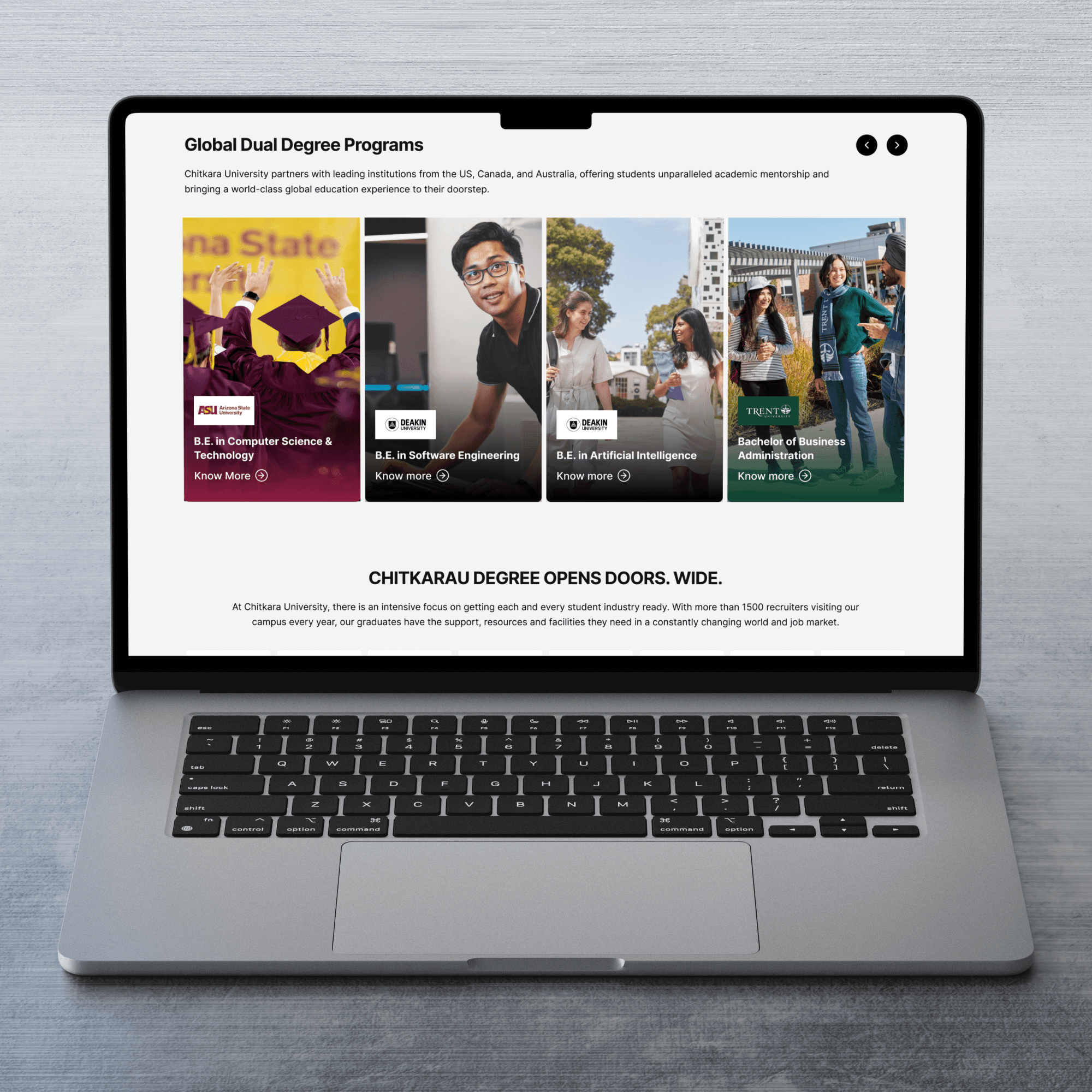
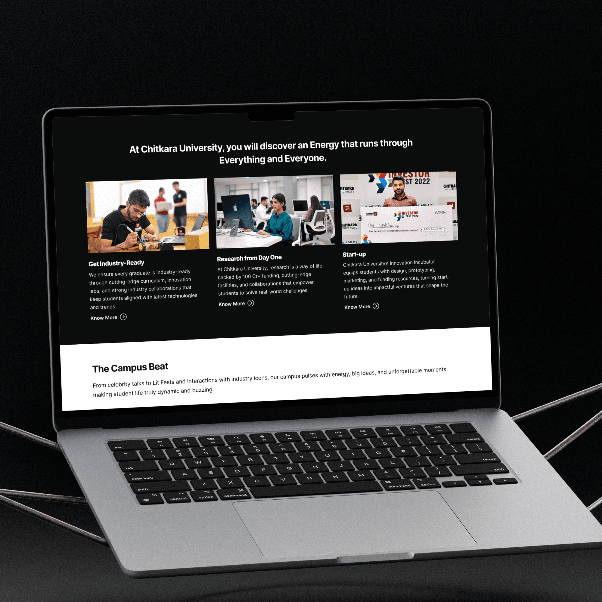
A structured program finder was introduced to allow users to explore programs by discipline, level, campus, duration, and eligibility. Program Detail Pages were redesigned as conversion engines with clear summaries, curriculum, research opportunities, placements, and strong CTAs. The admissions journey was simplified into step-by-step flows with integrated online applications, while trust-building content such as rankings, accreditations, and placement statistics was surfaced prominently. A mobile-first approach ensured ease of use for Gen-Z users.
UI Design & System Foundation
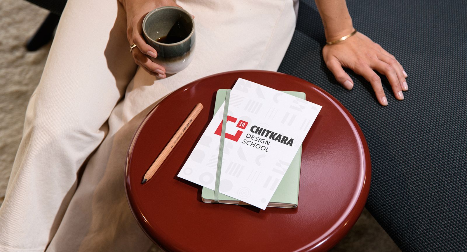
A unified design system was created using Chitkara’s brand colors, structured grids, standardized typography scales, reusable cards, CTAs, elevation patterns, and iconography. The visual direction remained bold, progressive, confident, and trustworthy, ensuring consistency across hundreds of pages while enabling scalability and faster development.
Role & Responsibility
I led UX strategy, IA redesign, and design system alignment for the university’s main website. My focus was on simplifying discovery, improving program findability, supporting high traffic loads, and creating a strong designer–developer collaboration model.
Collaboration with Developers
Working Model
Weekly sync-ups with backend & frontend
Design feasibility sessions
Component library documentation
Performance-optimized components
Lazy-loaded heavy sections
Compressed images & caching strategies
Performance Considerations
Efficient rendering
CDNs for images
Code splitting
Static pre-rendering for heavy sections

Final Solution
A modern, structured, conversion-focused university website:
Guided program discovery
Clear IA
High-performance pages
Visual consistency
Strong storytelling (placements, rankings, facilities)
Mobile-first approach
Impact
Post-redesign outcomes showed improved navigation efficiency, reduced drop-offs on program detail pages, increased time spent exploring programs, faster page load times, and stable performance during high-traffic admission periods. Qualitative feedback indicated that students found the site easier to explore, admissions teams received fewer clarification calls, and marketing teams saw better alignment between brand storytelling and user experience.
Reflections
This project reinforced the importance of ruthless prioritization in content-heavy platforms, deep collaboration between design and engineering for performance, program-first architecture to reduce cognitive load, consistent branding to build trust, and a mobile-first mindset as a default rather than an afterthought.